
A reader of Melbourne’s Herald-Sun newspaper has posted some data from the Australian Bureau of Meteorology, purporting to show a total lack of climate change, in spite of steadily increasing CO2 concentrations:

Funily enough, when you take a slightly longer view frrom the very same site, and smooth out the monthly variations, you get a totally different picture:

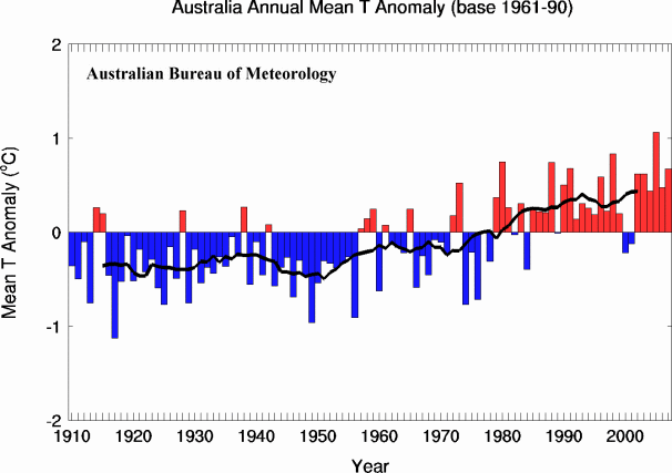
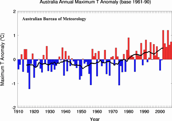
The black line in the lower graphs is the 11 year moving average.

The first chart you show has many more points per year, perhaps monthly or more frequent, compared to annual for the lower three charts. The fluctuation in the monthly data seems to make it look like there’s no overall effect (i.e., the values average out to zero), but I’m sure averaging the values together to get annual values, or using a moving average, would show a positive skew in the top chart, just as in the lower charts.
LikeLike
Pingback: meteorology