Following my recent post on passing 3D arrays from Python to Excel I have now added a py_UmomC function to the py_RC Design spreadsheet. The new spreadsheet and Python code, along with related code, can be downloaded from:
Also see py_RC Design 2 for more details of the other functions in the spreadsheet, and Python and pyxll for information about the required pyxll add-in, together with a discount voucher for new users.
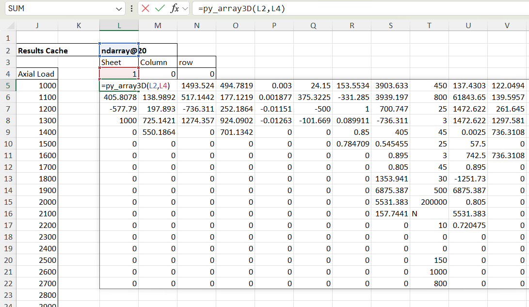
The new py_UmomC function returns all the results from py_Umom as a cache object, which displays the cache name in a single cell. If the results are for a single axial load and/or cross section the cache is 2D, but if the input axial load was an array the cache is a 3D array, with each “sheet” having the results for each axial load value.
The chosen results can be displayed with the py_array3D function. In the example below results are displayed for Column 11, Row 3 (the ultimate shear capacity), and because the Sheet is entered as zero results are returned for all input axial loads:
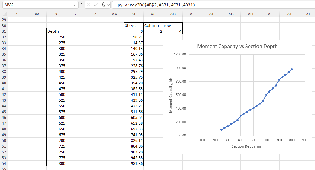
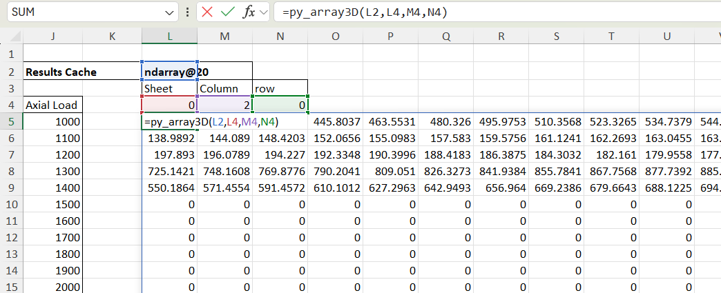
Changing the Column/Row values to 2 and 4 returns the ultimate bending capacity:
The py_Umom function can also return results for an input array of section depths, optionally with associated reinforcement areas. The axial load may be varying or constant:
As before, different results are returned using the py_Array3D function calling the same cache object with different column and/or row specified:
If the output row is entered as 0 the results are returned as a 2D array, with all the results for the specified column and each axial load in the results columns:
Specifying a single column and sheet returns a column array for the specified axial load, and/or cross section:
and specifying Sheet, Column, and Row returns a single value:
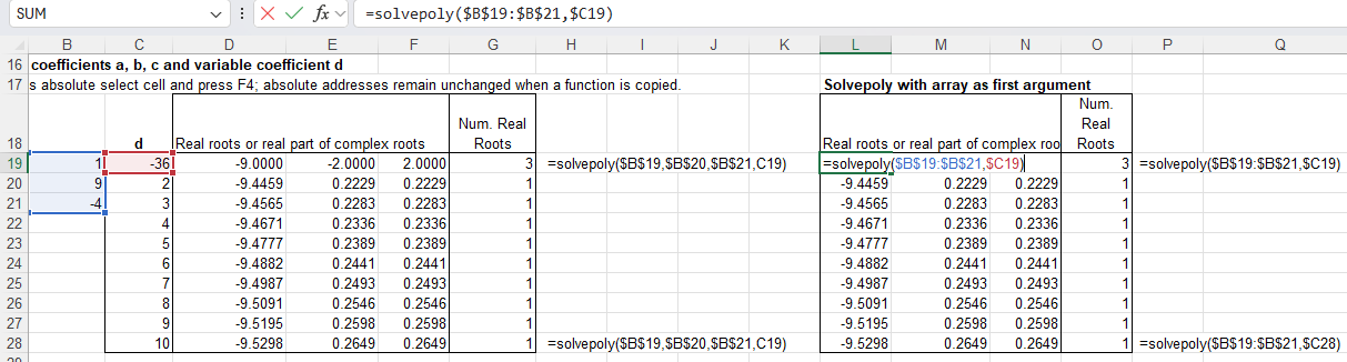
SolvePoly was amended to accept numbers or signed cell addresses in the input.
QuarticR, CubicR, QuadraticR and SolvePolyR functions were added, returning only the real roots.
SolvePoly was modified to return all real roots before the complex roots, and sort all real roots in ascending order in all cases.
The CubiCC was found to have been corrupted at some stage, and was returning incorrect results in some cases. It has been corrected and verified against the SolvePoly function and by checking the returned error values.
SolvePoly was modified to allow the first input argument to be either a single row or column range, with any remaining coefficients entered as single cells or values.
The Python polynomial functions have been moved to the pyNumpy module.
The previous post looked at options for displaying 1D or 2D arrays in Excel. This post will look at passing 3D arrays from Python to Excel as a cache object, using pyxll, and how to extract selected data from the cache. It will use the py_Umom function, as in the last post, with the addition of functions to handle the cache object. The new code is still being finalised, but will be made available for download when complete.
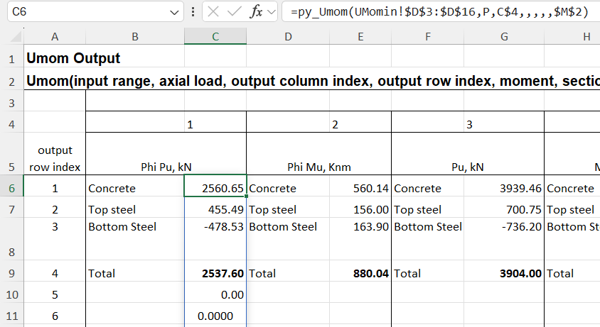
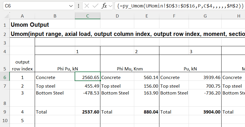
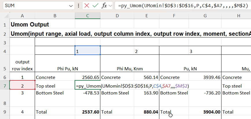
The py_Umom function calculates the ultimate strength of a reinforced concrete section subject to specified applied loads. Results of the analysis are available in 12 different column arrays, one of which must be chosen when the function is entered. The screenshot below shows the first 3 of the 12 results arrays, each of which must be entered as separate function:
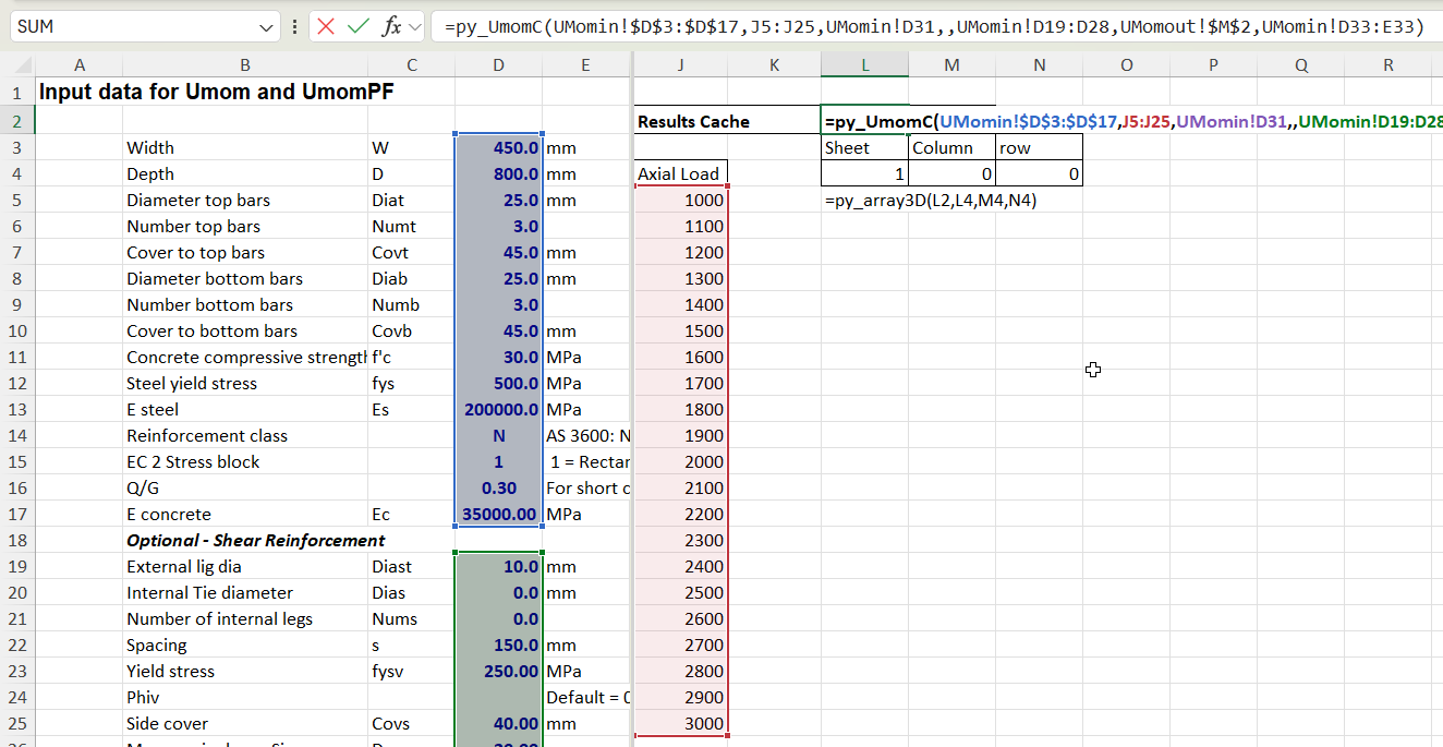
The new py_UmomC function combines all 12 columns into a 2D array. In addition it is possible to calculate results for any number of different applied axial loads, in which case all the results are combined into a 3D array. In either case, the results are returned as a cache object, which displays as text in a single cell. Chosen results from the cache can then be displayed using the py_array3D function, as illustrated below.
Input for the py_UmomC function is the same as for py_Umom, except that no output index values are required because the function returns all available results. In the example below the py_UmomC function is entered in cell L2, and the input includes a range of 21 different axial loads:
Selected results can then be displayed with the py_array3D functions, which has options for displaying a selected “sheet”, and/or optionally selected columns or rows. If column and row are not selected the function returns all results for the specified axial load:
If a column is specified, and the sheet is set to zero, the function returns results for the specified column over the full range of axial loads, returned as a 2D array:
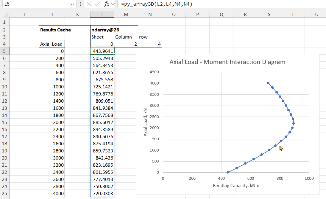
If a row is then specified the results for that value over the input axial load range are returned as a column array. In the example below the results are total design bending capacity:
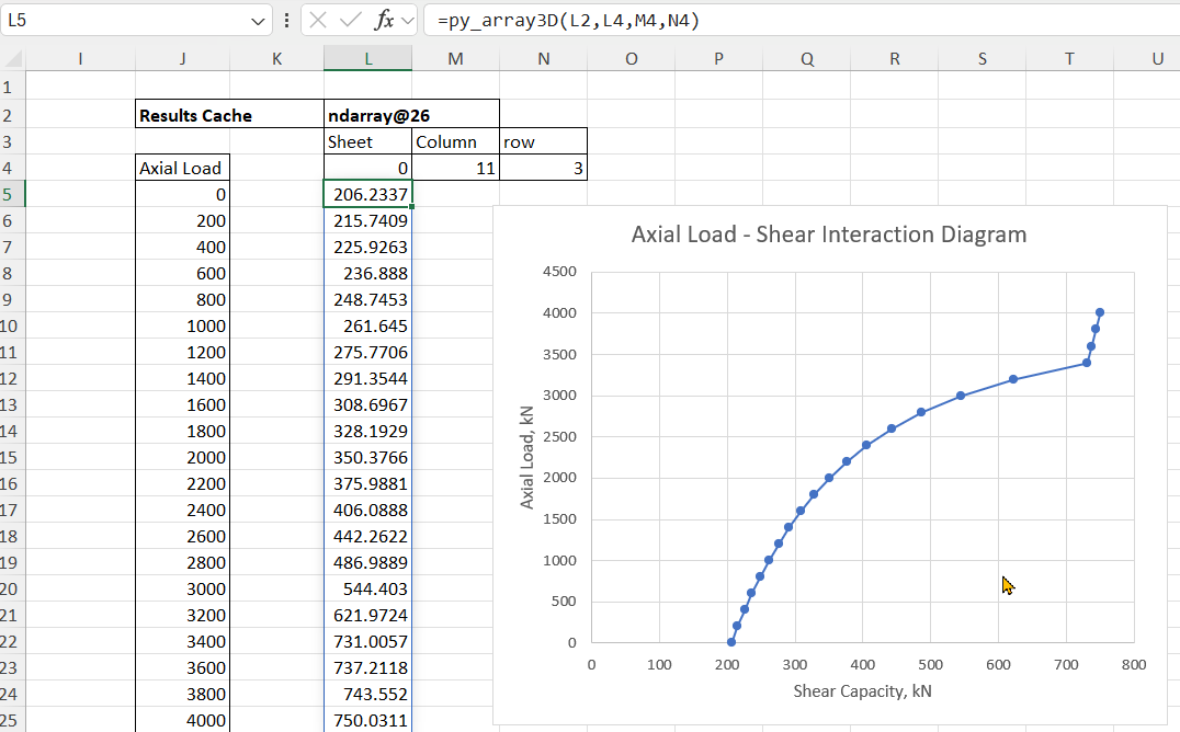
Any other results can then be extracted from the results cache, for example total design shear capacity:
Many of the user defined functions (UDF’s) presented in this blog return an array rather than a single value. Options for displaying arrays in Excel have changed significantly in recent years and this post looks at the most efficient ways of working with these changes, including some situations when the old way is still the best.
In addition to the built-in Excel options, using Python code via pyxll allows large multi-dimensional arrays to be passed to Excel as a cache object, which has significant advantages in some situations. This will be covered in more detail in the next post.
The screenshot below shows output from the py_Umom UDF entered as a fixed array:
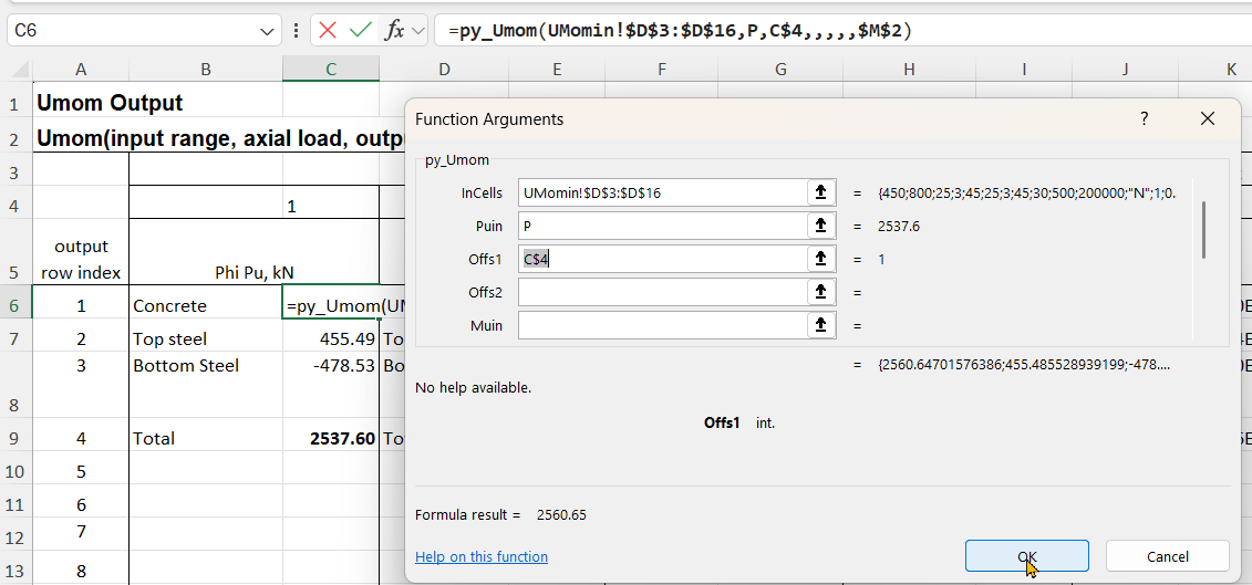
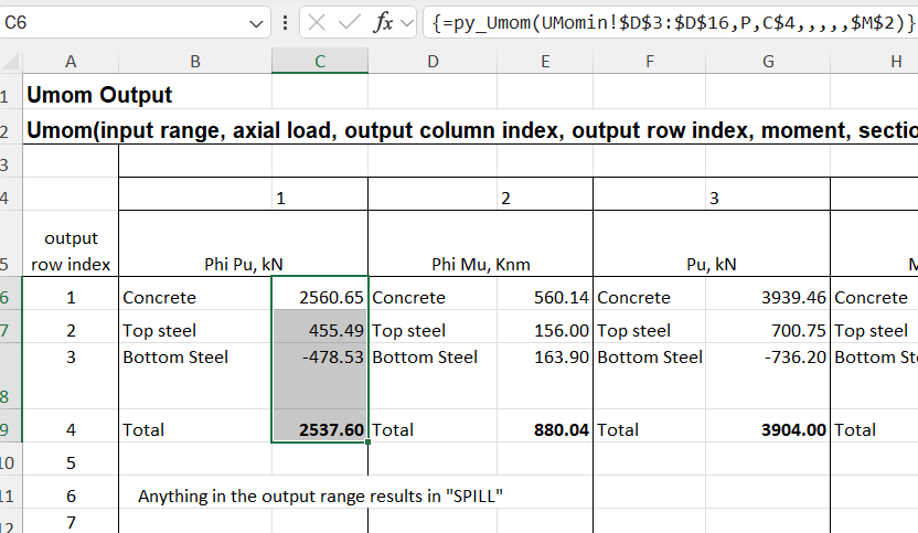
The function shown in cell C6 returns a column array. In old versions of Excel only the first cell is returned, but in recent years “dynamic arrays” have been introduced, which automatically display the whole array. Either way, the array can be entered to display fully or in part with the following steps:
Enter the function in the top cell and press enter in the usual way
Select the range of cells to be displayed, in this case C6:C9
Press F2 for edit mode, then Ctrl-Shift-Enter
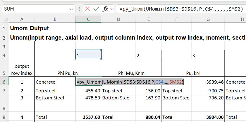
The function will then display as above, with values in the selected cells, and the function encased in braces, {}, in the edit line.
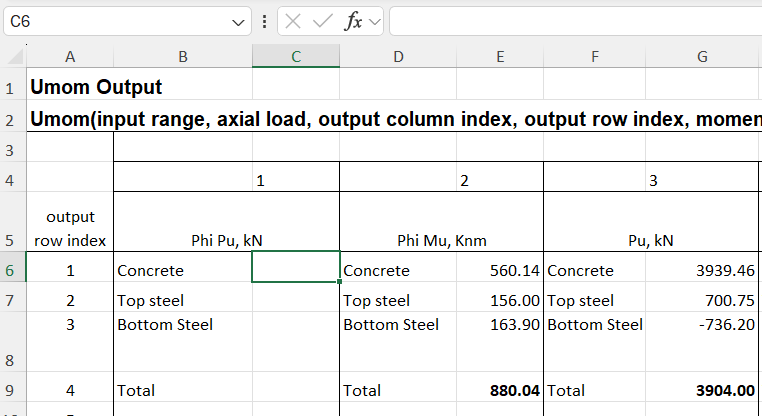
It may be desired to return to the default display, either to change the extent of the displayed array in any Excel version, or to display the full dynamic array in recent versions. In that case:
Select the top cell and press F2 (edit mode)
Press Ctrl-A to select all the formula text:
Press Ctrl-X to cut the formula and copy to the clipboard
Press Ctrl-Shift-Enter
All the cells will now be empty
With the cursor still in cell C6, press Ctrl-V to re-paste the formula
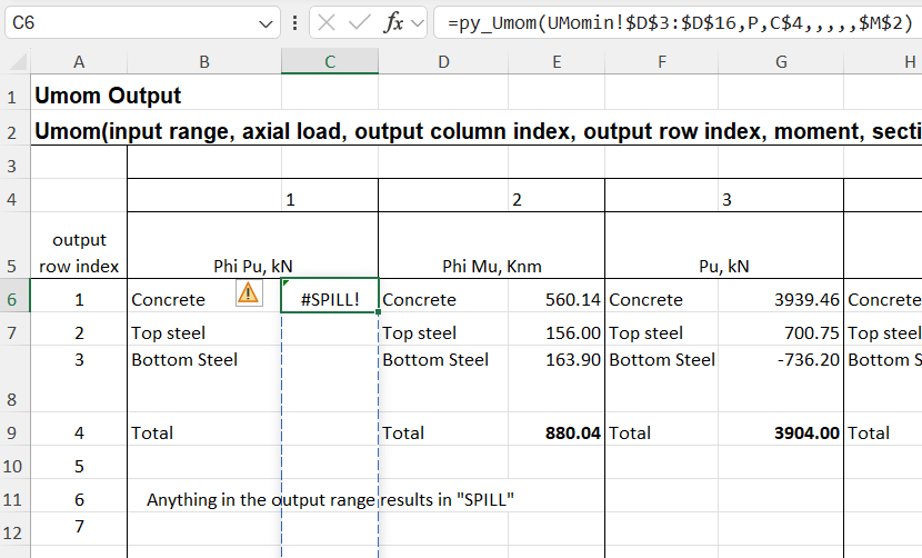
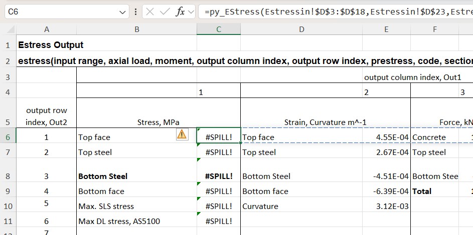
In this case the dynamic array returns zeros in multiple cells below the desired results. One problem with this, other than appearance, is that if any text is entered in a cell in the output range, the entire output will change to “#SPILL!” in the top cell, with all the others displaying as blank:
The only way to fix this whilst maintaining the dynamic array is to change the UDF code to remove the empty cells before they are returned to Excel. Alternatively, do it the old way and:
Select the desired output range
Press F2
Press Ctrl-Shift-Enter
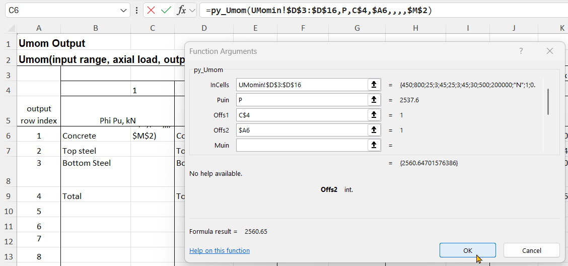
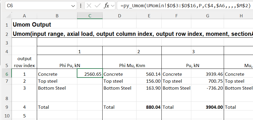
An alternative for the py_Umom function is to enter the Offs2 input, which specifies the row number, with that row being returned a single value:
The formula is entered with the Enter key, which displays the single value, without the {}.
With Offs2 entered as a relative address, with no $ before the 6, the formula can then be copied to the other 3 rows:
The py_Estress function currently works differently, when the output row is defined it returns a row array with the chosen result in the first cell, and other unwanted data in the rest. This is not a useful feature, but it’s a work in progress. When the function is entered as a dynamic array recent versions of Excel will return the whole row, but just display #SPILL! if any of the cells in the output range are not empty:
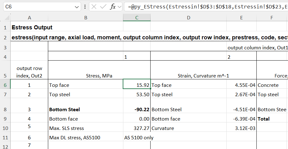
The first cell can be displayed with Ctrl-Shift-Enter, but an alternative that may be preferred, and is often inserted automatically by Excel, is to insert @ at the start of the formula, known as the “implicit intersection operator”. This has different behaviour when used on Excel tables of ranges, but for a range returned by a UDF, either VBA, Python, or any other code, it returns the first value of the array, or the top-left for a 2D array:
More details of the @ operator can be found at the Microsoft Site.
As far as I know, Ctrl-Shift-Enter is the only built-in way to display part of an array returned by a UDF, and the displayed results have to start at the top-left. Alternative options using the pyxll cache object will be discussed in the next post.