This post is a compilation of information from Stephen Bullen, Jan Karel Pieterse, and George Lungu. To quote JKP “When doing mathematics, wouldn’t it be nice if we could type an equation into a cell in Excel and immediately see the resulting graph?” Well we can, and since the technique is well documented at the links above, I will extend it a little to plot a parametric equation, that is an equation where both x and y are functions of some other parameter. A recent post at George Lungu’s Excel Unusual blog describes how to generate the data for a Lissajous Figure on the spreadsheet, and then plot it in an XY chart. The equations for a Lissajous Figure are an example of a system of parametric equations, so I have used these as the example. The resulting spredsheet can be downloaded from PlotLS.xls
The basic steps are:
- Enter on the spreadsheet as text the functions for x and y. The functions may be entered with or without a leading equals sign, but if you want to start with a = you must first enter an apostrophe, so that the text is not treated as a live spreadsheet function. These text functions will be used to generate arrays of values to be plotted, using defined names.
- In the case of a parametric equation we will also need to generate an array of equally spaced values over a specified range.
- The generated arrays can then be plotted in an XY chart by assigning the data ranges to the defined names, rather than to spreadsheet ranges.
An array of equally spaced values can be generated by using the Excel Offset() and Row() functions:
- The function =OFFSET(Sheet1!$A$1,0,0,n,1) will generate a single column range, starting at cell A1, and extending n rows.
- Surround this with the Row function: =ROW(OFFSET(Sheet1!$A$1,0,0,n,1)), and this will return an array of integers from 1 to n, that is the row numbers of the cells in the range.
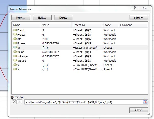
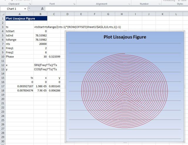
- This is then multiplied by the step increment, plus the starting value, yielding the desired array of values: =tsStart+tsRange/(nts-1)*(ROW(OFFSET(Sheet1!$A$1,0,0,nts,1))-1)
For a plot of Y as a function of X this array of values is assigned to the X range, but in the case of a parametric equation it is assigned to the common parameter, in this case ts (for time-step):
The X and Y values for a Lissajous Figure are given by:
- X = SIN((Freq1*Ts+Phase))
- Y = SIN(Freq2*Ts)
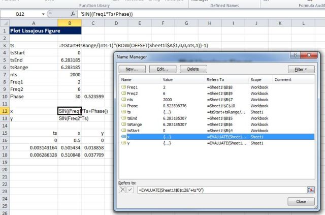
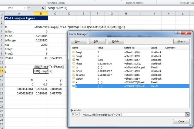
These equations are entered as text into any two spreadsheet cells (without the X= and Y=), and then defined names are created to evaluate the functions. Note that variables may either defined by cell addresses, or by named ranges, as in this case:
Note that:
- The ranges are defined as local to the sheet on which they occur. This must be done at the time they are created.
- The name definitions use the Evaluate function (=EVALUATE(Sheet1!$B$12&”+ts*0″)), and are terminated with the strange looking sequence: “+ts*0”. This is a workaround required when the function to be evaluated includes any Excel function (in this case the SIN function)
- After the names have been defined it is a good idea to enter them as array functions on the spreadsheet, to check that they are returning the desired values; e.g. enter =ts, select the current cell and a few rows down, press F2, press ctrl-shift-enter (see range: A15:c18 on the screenshot). The values on the spreadsheet may be deleted after checking, they are not required for the chart.
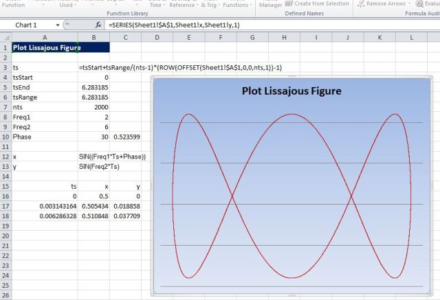
After creating all the required defined names, create an XY chart (you can use the sample data created in the step above as the initial chart data range, but any other range will do). Finally the defined names, X and Y, are assigned to the chart X and Y ranges:
Note that the full local defined name must be specified, i.e. =Sheet1!x and =Sheet1!y
The text for the parametric equations may now be changed on the spreadsheet, and the chart will re-plot instantly to display the new curve.
Finally I should acknowledge the assistance of Jan Karel Pieterse in getting the parametric version of these charts working, after I had managed to convince myself that the system only worked for plotting Y as a function of X.

Neat technique, well done to all those involved for getting this working in Excel 2007, as others say, however, there are a few caveats with the use of Evaluate. I’ve often wondered about a similar problem i’ve not seen discussed elsewhere – how to plot an arbitrary array of points without needing to output them to a sheet range?
For simplicity suppose you just want to plot integer values. Perhaps the most obvious way is to select your chart series and enter from the immediate window: Selection.values=[row(1:50)]. This can be extended in Excel 2007 to up to 32000 points, but in previous versions an alert message about the length of formula prevents this. You can safely skip past this warning if it appears in Excel 2007 and it’s only a minor irritation that can probably be surpressed somehow.
Another option is to create a name and use this name in your chart series definition eg: names.add “y”, [row(1:50)]. This approach can be extended up to the maximum number of points in all versions, the only shortcoming seems to be that the new file formats don’t like names longer than 8192 characters.
One further approach, having defined “y” as above, is to enter: executeexcel4macro “series.y(,!y)”. This will assign the array of values to the selected chart series and does appear to work in all versions. There are likely other ways, issues overlooked, etc. i’d be interested to know others thoughts.
LikeLike
Hi Lori
It seems to me that the simplest approach is to create defined names (say Sheet1!x and Sheet1!y) and assign those names to the Chart ranges, then you can simply change the definition of the name to be a VBA array. For instance the code below will create a graph of a spiral with 4001 points:
Pi = Atn(1) * 4
For i = 1 To 4001
Theta = Pi * (i – 1) / 200
Xvals(i) = i * Sin(Theta)
YVals(i) = i * Cos(Theta)
Next i
ActiveWorkbook.Names.Add Name:=”Sheet1!x”, RefersToR1C1:=Xvals
ActiveWorkbook.Names.Add Name:=”Sheet1!y”, RefersToR1C1:=YVals
LikeLike
Linking the chart series to names works well for xls files but in this case the trouble is it won’t save in the new file formats – at least for me.
A possible alternative is to place the arrays into the series directly, you can do this by appending the lines below to your example code (just ignore the prompt if you need to select the series manually).
Charts.Add
ActiveChart.ChartType = xlXYScatterLinesNoMarkers
With ActiveChart.SeriesCollection
If .Count = 0 Then .NewSeries
If Application.Version >= 12 Then
.Item(1).Values = yVals
.Item(1).xValues = xVals
Else
.Item(1).Select
ExecuteExcel4Macro "series.y(,sheet1!y)"
ExecuteExcel4Macro "series.x(sheet1!x)"
End If
End With
ActiveChart.ChartArea.Select
Names("sheet1!x").Delete
Names("sheet1!y").Delete
LikeLike
Pingback: Seeing through Mingus eyes | Newton Excel Bach, not (just) an Excel Blog
Pingback: Daily Download 8: Drawing in Excel | Newton Excel Bach, not (just) an Excel Blog
Pingback: Charts and Charting | Newton Excel Bach, not (just) an Excel Blog
Pingback: Use Matplotlib from Excel with xlwings | Newton Excel Bach, not (just) an Excel Blog