Contour plots are widely used for a great variety of purposes, but facilities for producing them in Excel are very limited, and those that are provided are very well hidden. In this post I will look at some simple examples from the Python Matplotlib library, linking the input and resulting plots to Excel using pyxll, and compare with Excel’s capabilities for producing contour plots. The following post will look at some of the much more extensive facilities in Matplotlib.
The first example plot (below) is based on the Matplotlib documentation at:
Matplotlib Contourf example
modified to accept input of the X and Y data and the colour bar data from Excel:

The Python code accepts input of the X and Y data and the data required to generate the contour colours and ranges:
@xl_func()
@xl_arg('levels', 'float[]')
@xl_arg('colors', 'numpy_array<var>', ndim = 2)
def contour_plot_ex1(Xvals, Yvals, levels, colors):
    # Use Numpy meshgrid to convert the 1D input lists to 2D grids
    X, Y = np.meshgrid(Xvals, Yvals)

    # Calculate the Z array with Numpy functions
    Z1 = np.exp(-X**2 - Y**2)
    Z2 = np.exp(-(X - 1)**2 - (Y - 1)**2)
    Z = (Z1 - Z2) * 2

    # If the first element of colors is a string, extract the first column and convert to a list
    if isinstance(colors[0,0], str):
        colors = colors[:,0].tolist()
    else:
        colors = colors.tolist()
    fig,ax=plt.subplots(1,1)
    # Generate the contour plot with contourf, using contour bands specified in the levels list, and colours specified in colors
    cp = ax.contourf(X, Y, Z, levels=levels, extend='both', colors= colors)

    fig.colorbar(cp) # Add a colorbar to a plot
    ax.set_title('Filled Contours Plot')
    # Send to Excel with pyxll.plot
    pyxll.plot(fig)
    return "Contour Plot Example 1"
Input for the ‘levels’ and ‘colors’ arguments is shown in the screenshot below:

The X and Y data is listed in single column ranges (or in this case the same range for X and Y). ‘levels’ is a single column range listing the values for each contour boundary, and ‘colors’ may be a single column range with color codes, or a three or four column range specifying the color components (see Matplotlib documentation for details).
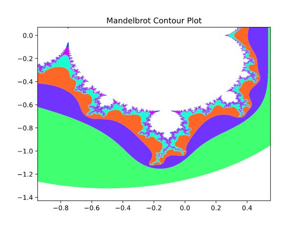
The contourf function can also be used as an alternative for plotting the Mandelbrot set (although it is much slower in generating the plot than the procedures used in previous posts):

@xl_func()
@xl_arg('width', 'int')
@xl_arg('height', 'int')
@xl_arg('maxiter1', 'int')
@xl_arg('itfactor', 'int')
@xl_arg('levels', 'float[]')
@xl_arg('colors', 'float[][]')
def contour_mandelplot(xc,xrange,yc,yrange, maxiter1, zoomfact, itfactor, width, height, levels, colors):
    dpi = 72
    img_width = (dpi * width)
    img_height = np.int(dpi * height*1.5)
    xrange0 = xrange
    xrange = xrange/zoomfact
    yrange = yrange/zoomfact
    xmin = xc - xrange/2
    xmax = xmin + xrange
    ymin = yc - yrange/2
    ymax = ymin + yrange

    if zoomfact > 1:
        maxiter = np.int(np.log(xrange0/xrange)*itfactor+maxiter1)
        if maxiter < maxiter1: maxiter = maxiter1
    else:
        maxiter = maxiter1
    X,Y,Z = mandelbrot_set5(xmin,xmax,ymin,ymax,img_width,img_height,maxiter)

    fig,ax=plt.subplots(1,1)
    cp = ax.contourf(X, Y, Z, levels=levels, extend='both', colors= colors)

    ax.set_title('Mandelbrot Contour Plot')
    pyxll.plot(fig)
    return maxiter
A more practical example is plotting finite element analysis results, where we will compare Matplotlib alternatives and Excel contour plots with output from the FEA program Strand7. The first FEA example is a very simple 2D plane strain analysis with 6 rectangular plates, restrained horizontally along the two vertical edges, vertically and horizontally along the base, with a downward deflection of 10 mm applied to the top left corner. The Strand7 vertical deflection results are shown below:

Each plate in the Strand7 model is defined by 8 nodes (the corners and the midpoint of each side), but the Excel contour plot and the standard contourf input require a rectangular grid, with an equal number of points in each row, and for the Excel plot, equal spacing between each point. The contoured data is also required to be in a 2D grid. To satisfy those requirements the deflections were extracted along the top and bottom edge of each plate as shown below:

The Matplotlib code, modified to accept input of the Z data was:
@xl_func()
@xl_arg('levels', 'float[]')
@xl_arg('colors', 'float[][]')
def contour_plot2(Xvals, Yvals, Z, levels, colors):
    X, Y = np.meshgrid(Xvals, Yvals)

    fig,ax=plt.subplots(1,1)
    cp = ax.contourf(X, Y, Z, levels=levels, extend='both', colors= colors)

    fig.colorbar(cp) # Add a colorbar to a plot
    ax.set_title('Filled Contours Plot')
    pyxll.plot(fig)
    return "Contour Plot Example 2"
and the resulting output:

The same input data shown above can be used to generate a contour plot in Excel as follows:
- Select the XYZ data arranged as a single range (Range I4:N8 in the data screenshot below).
- Select the Insert tab, then the ‘Waterfall, Funnel, Stock, Surface, or Radar chart’ group
- Click on the 3rd icon from the ‘Surface’ selection (Contour)

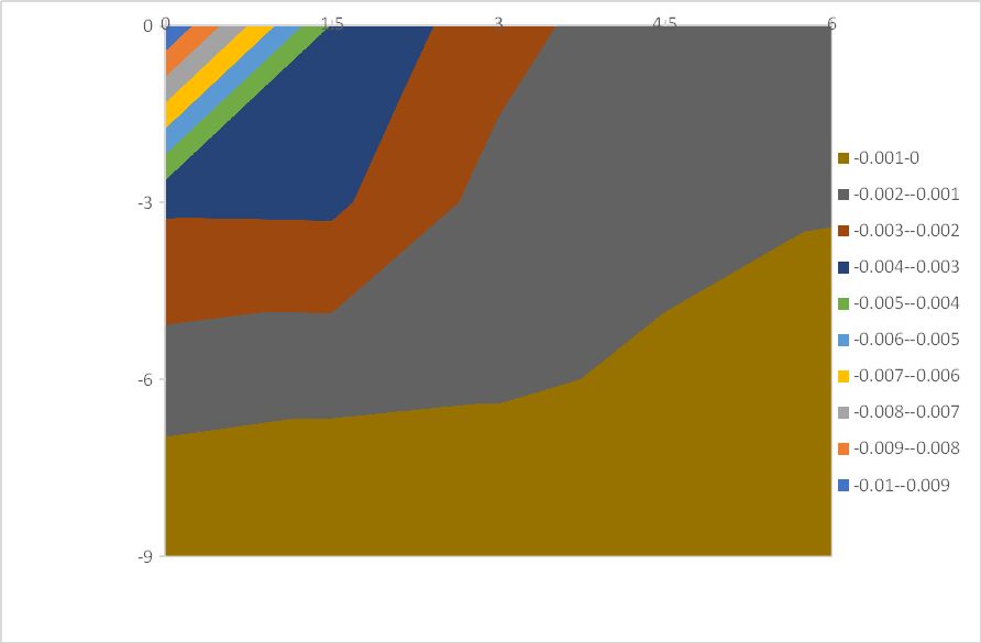
The resulting chart, with all default settings, is:

The Matplotlib results are reasonably close to the Strand7 plot, the main differences being:
- The horizontal and vertical dimensions are not plotted to equal scale
- The interpolation of the contours is more jagged, because the vertical mid-side nodes were ignored
Dealing with these differences will be discussed in the next post.
The Excel chart with default settings on the other hand is almost useless. As well as the scale issue:
- The chart is inverted, with Y values increasing from top to bottom
- There are only 3 contour bands, resulting in a greatly simplified plot
- Graded shading of the plot, intended to improve the readability of 3D surface charts, is also applied by default to 2D contour plots, making contour bands difficult to interpret, and in this case almost unreadable
These formatting problems can be fixed, but the procedures for doing it are very far from obvious. An excellent article by John Peltier provides detailed instructions, and the Excel 2007 procedure is still applicable to Excel 365.
Contour and Surface Charts in Excel 2007
In addition to the suggestions in the link, the Y axis being listed in reverse order seems to cause plotting problems which can be fixed by:
- Select the vertical axis
- Select Axis Options (right hand icon at the top of the dialog)
- Select ‘Series in reverse order’
The chart then looks like:


Pingback: Scipy Functions with Excel and pyxll 9 – Special, distance, space and constants functions and FFT | Newton Excel Bach, not (just) an Excel Blog