
In the previous post we saw that if a trend line equation is added to a line chart it will return the wrong coefficients if the x values are not a continuous sequence of integers, starting at 1 (click on any image for full size view):
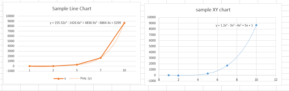
Using an XY chart in place of the line chart is one way to get the correct trend line (which will work for any sequence of x values), but there is another way:
Right click on the X axis, and select Format Axis … then set Axis Type to Date axis:
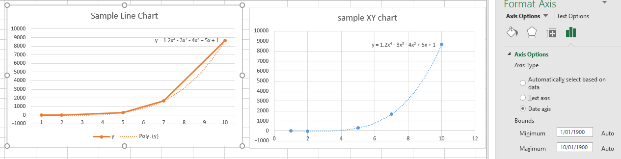
The line chart and the XY chart now display the same (correct) trend line.
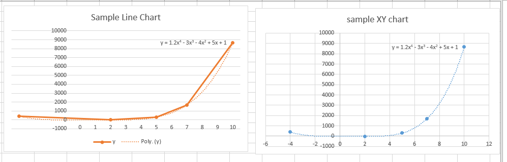
The trend line will also still work correctly if there are one or more negative x values (although the values do not display in the axis labels):
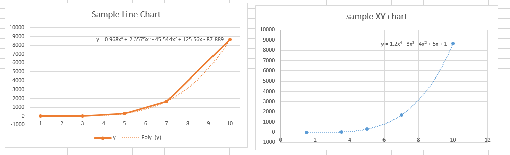
But be careful, the line chart treats the x values as being date numbers, and truncates all decimal values to the integer part:
For more details see Jon Peltier’s blog.

Pingback: #Excel Super Links #20 – shared by David Hager | Excel For You