This post is prompted by a recent comment at Using LINEST for non-linear curve fitting which found that the trend line formula displayed on a chart was totally different from that found using the Linest function.
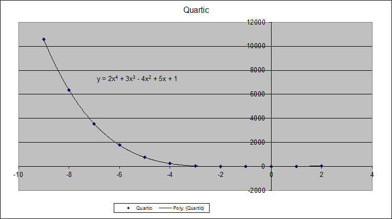
The problem was caused by using a line chart, rather than an XY (scatter) chart. A line chart treats the x-axis values as text labels, even when the data range is formatted as numbers. When calculating a trend line Excel treats the x range as a consecutive sequence of integers starting at 1, regardless of the value displayed. As a result, if the x values are any other sequence the trend line equation displayed will be totally different to the correct one.
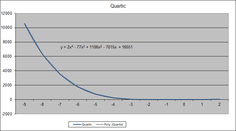
The solution is simple, convert the chart to an XY chart.
As an example, the screenshot below shows the function:
y = 2x^4 + 3x^3 – 4x^2 + 5x + 1
plotted on a line chart:
The trend line is a good fit to the plotted points, but the calculated trend line formula is totally different to the correct one.
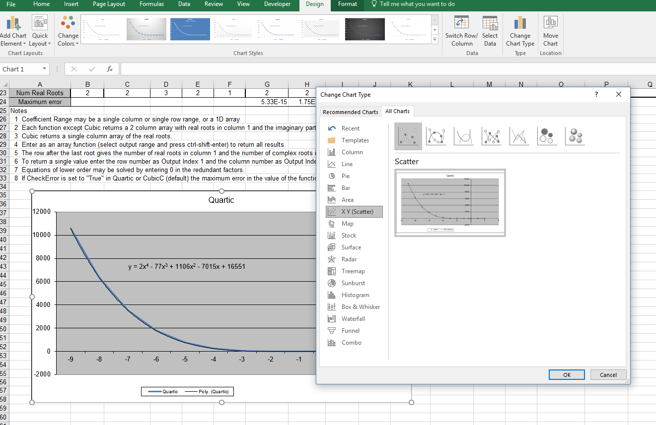
The chart type can be changed to an XY (Scatter) type, using the Chart-Tools, Design ribbon:
The function formula then displays correctly: