… with Python, Numba and pyxll.
As promised in the previous post, this post will look at alternative procedures for calculating and plotting the Mandelbrot set with Python based code.
The spreadsheet presented here and the associated Python code may be downloaded from:
https://interactiveds.com.au/software/FastMandelbrot.zip
Note that pyxll is required to link the Python code to Excel.
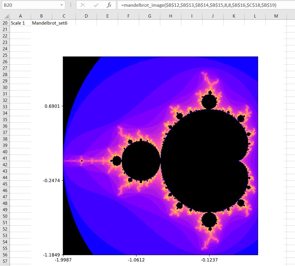
Seven alternative Python routines were used to produce the images shown below, using code based on data available at the Github site: https://gist.github.com/jfpuget/60e07a82dece69b011bb


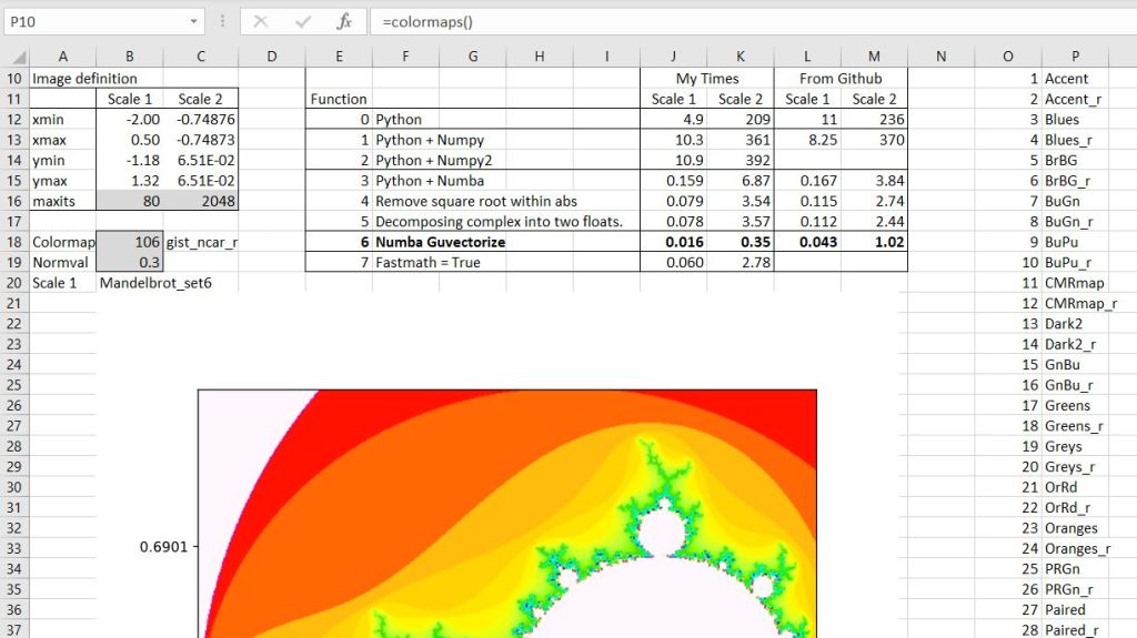
Input data for the two images, and times for the 7 routines to generate the data are shown in the screenshot below:

The second image is zoomed in by a factor of 100,000, which requires many more iterations to define the image, resulting in execution times 20-50 times longer.
The first function uses plain Python, which works very slowly, but illustrates the simplicity of the computation used to generate the complex images, with repeated looping through the procedure:
# 0 All python
def mandelbrot(z,maxiter):
    c = z
    for n in range(maxiter):
        if abs(z) > 2:
            return n
        z = z*z + c
    return maxiter

@xl_func
@xl_arg('width', 'int')
@xl_arg('height', 'int')
@xl_arg('maxiter', 'int')
def mandelbrot_set0(xmin,xmax,ymin,ymax,width,height,maxiter):
    r1 = np.linspace(xmin, xmax, width)
    r2 = np.linspace(ymin, ymax, height)
    res = (r1,r2,[mandelbrot(complex(r, i),maxiter) for r in r1 for i in r2])
    return res
The next two functions replace lists with Numpy arrays, but the result is even slower:
# 1 Relace lists with Numpy arrays
@xl_func
@xl_arg('width', 'int')
@xl_arg('height', 'int')
@xl_arg('maxiter', 'int')
def mandelbrot_set1(xmin,xmax,ymin,ymax,width,height,maxiter):
    r1 = np.linspace(xmin, xmax, width)
    r2 = np.linspace(ymin, ymax, height)
    n3 = np.empty((width,height))
    for i in range(width):
        for j in range(height):
            n3[i,j] = mandelbrot(r1[i] + 1j*r2[j],maxiter)
    res = (r1,r2,n3)
    return res
See the download file for the second function using Numpy arrays (which is even slower).
Using the Numba jit compiler greatly increases the speed of the code, and is very simple to use, just requiring the addition of the @njit decorator to the start of the code:
# 3 Compile code with Numba
@njit
def mandelbrot3(c,maxiter):
    z = c
    for n in range(maxiter):
        if abs(z) > 2:
            return n
        z = z*z + c
    return 0

@xl_func
@xl_arg('width', 'int')
@xl_arg('height', 'int')
@xl_arg('maxiter', 'int')
@njit
def mandelbrot_set3(xmin,xmax,ymin,ymax,width,height,maxiter):
    r1 = np.linspace(xmin, xmax, width)
    r2 = np.linspace(ymin, ymax, height)
    n3 = np.empty((width,height))
    for i in range(width):
        for j in range(height):
            n3[i,j] = mandelbrot3(r1[i] + 1j*r2[j],maxiter)
    res =  (r1,r2,n3)
    return res
Removing the square root operation from the code resulted in a further doubling of the speed, but replacing the complex number operations with two floats made almost no difference (see download file for details). Using the Numba fastmath function (function 7) gave a small increase in performance, but the @guvectorize() decorator resulted in a ten times increase in speed; a total speed improvement of about 1000 times for the second image:
# 6 Use guvectorize
@njit(int32(complex128, int64))
def mandelbrot6(c,maxiter):
    nreal = 0
    real = 0
    imag = 0
    for n in range(maxiter):
        nreal = real*real - imag*imag + c.real
        imag = 2* real*imag + c.imag
        real = nreal;
        if real * real + imag * imag > 4.0:
            return n
    return 0

@guvectorize([(complex128[:], int64[:], int64[:])], '(n),()->(n)',target='parallel')
def mandelbrot_numpy(c, maxit, output):
    maxiter = maxit[0]
    for i in range(c.shape[0]):
        output[i] = mandelbrot6(c[i],maxiter)


@xl_func
@xl_arg('width', 'int')
@xl_arg('height', 'int')
@xl_arg('maxiter', 'int')
def mandelbrot_set6(xmin,xmax,ymin,ymax,width,height,maxiter):
    r1 = np.linspace(xmin, xmax, width, dtype=np.float64)
    r2 = np.linspace(ymin, ymax, height, dtype=np.float64)
    c = r1 + r2[:,None]*1j
    n3 = mandelbrot_numpy(c,maxiter)
    res =  (r1,r2,n3.T)
    return res
Having generated the Mandelbrot data, a graph can be generated in Excel using Matplotlib and the pyxll plot function:
 Plot image
@xl_func
@xl_arg('width', 'int')
@xl_arg('height', 'int')
@xl_arg('maxiter', 'int')
def mandelbrot_image(xmin,xmax,ymin,ymax,width=3,height=3,maxiter=80,cmap='hot', normval=0.3):
    dpi = 72
    img_width = dpi * width
    img_height = dpi * height
    x,y,z = mandelbrot_set6(xmin,xmax,ymin,ymax,img_width,img_height,maxiter)

    fig, ax = plt.subplots(figsize=(width, height),dpi=72)
    ticks = np.arange(0,img_width,3*dpi)
    x_ticks = np.round(xmin + (xmax-xmin)*ticks/img_width,4)
    plt.xticks(ticks, x_ticks)
    y_ticks = np.round(ymin + (ymax-ymin)*ticks/img_width, 4)
    plt.yticks(ticks, y_ticks)

    norm = colors.PowerNorm(normval)
    ax.imshow(z.T,cmap=cmap,origin='lower',norm=norm)
    pyxll.plot(fig)
    return "Mandelbrot_set6"
The appearance of the image can be varied with the two chart properties “cmap” and colors.PowerNorm. There are 166 named color maps, which have been listed on the spreadsheet using the lengthy code below:
@xl_func()
def colormaps():
        return plt.colormaps()

The appearance of any colormap can be seen in the chart simply by entering the index number in cell B18. Similarly the PowerNorm value (between 0 and 1) may be entered in cell B19.
The chart is created by entering the Mandelbrot_Image function in any cell, as shown in the first two images of this post. More details of the plotting function, and examples of the colormaps, will be given in the next post.

Pingback: Mandelbrot, Mojo, Numpy and Numba | Newton Excel Bach, not (just) an Excel Blog