Evaluate and display definite integrals in Excel with Latex and Matplotlib

The py_Evalu spreadsheet was last presented at Scipy Functions with Excel and pyxll 5 – Evaluate with Units and included the Plot_Math function, which converts a text string to Latex format, then uses Matplotlib to convert this to a graphic image, and optionally evaluates the function. To extend this functionality I have now added the Plot_Quad function to evaluate and display definite integrals.

The updated files are included in the py_SciPy zip file that can be downloaded from:

py_SciPy.zip

Details of the required pyxll package (including download, free trial, and full documentation) can be found at: pyxll

For those installing a new copy of pyxll, a 10% discount on the first year’s fees is available using the coupon code “NEWTONEXCELBACH10”.

Examples of the Plot_Quad function are shown on the Latex sheet.

Required inputs are:

  • The function to be integrated as a text string.
  • The integration limits.
  • Any fixed parameters and their values.

When the function is entered the result of the integration is returned in the function cell, and an image of the definite integral is displayed in Latex format immediately below. The image may be selected and dragged to any desired new location, as shown in the second example above. This example returns the area of a circle quadrant, which in this case is accurate to 15 significant figures.

Help on the function can be displayed by clicking on the “insert function” icon, immediately to the left of the edit line, to open the “function wizard”. This shows brief help on each function argument. Detailed help on the SciPy Quad function (used for the evaluation of the integral) can be displayed by clicking on “Help on this function”, at the bottom left of the function wizard display:

By default, the integration variable is “x”. Any other symbol may be specified with the optional “var” argument. Optional arguments for the quad function may also be specified with the “kwargs” argument (see the Scipy help for details of all options). In the example below the epsrel argument has been entered to allow a greater relative error in the result, with in this case only a small reduction in execution time:

In the next example the function has been used to find the force on a circular concrete section generated by a parabolic-rectangular stress distribution, as defined by the Eurocode 2 concrete design code. In this case two separate functions are required, for the rectangular and parabolic part of the stress distribution:

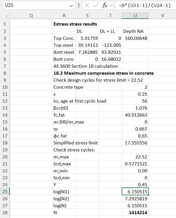
The resulting total force is compared with the results of the py_Circu concrete design function, showing near exact agreement.

The spreadsheet also has an on-sheet check using Simpson’s method with each block divided into 20 layers, showing good (but less exact) agreement:

Posted in Excel, Link to Python, Maths, Newton, Numerical integration, PyXLL, UDFs | Tagged , , , , , , , , , , , , | Leave a comment

py_RC Elastic 1.04 and fatigue to AS 3600

The py_RC Elastic spreadsheet (last discussed here) has been updated with a new function py_Fatigue3600, providing design for fatigue to the latest AS 3600 concrete structures code. The new spreadsheet and associated Python code can be downloaded from:

py_RC Elastic.zip

The download file includes full open-source Python code. For details of the pyxll package required to link the Python code to Excel see: https://newtonexcelbach.com/python-and-pyxll/

Input for the new py_Fatigue3600 function is as before. Note that the new function is intended for use on bridge structures, and the number of fatigue cycles is calculated to AS 5100.2 requirements, based on the current number of heavy vehicles/lane/day:

The output of both functions is shown below:

The main differences between the calculations to the two codes are:

  • Different variation in the steel fatigue stress limit related to the number of stress cycles. AS 3600 has a higher stress limit for mid-range cycles, but for low cycle numbers (as in this case), or very high cycles, the AS 5100.5 stress limits are higher.
  • For the concrete compressive stress limit AS 5100.5 has a conservative limit, not related to the number of cycles. AS 3600 has a procedure for calculating the number of cycles to failure for any specified compressive stress. This has been adapted in the function to calculate a stress limit for any given number of cycles. In most cases the AS 3600 limit is significantly higher than the AS 5100.5 simplified approach.

A check has been added to the spreadsheet to verify that the concrete stress limit calculated by the AS 3600 function does correspond with the required number of stress cycles:

Posted in Concrete, Excel, Link to Python, Newton, PyXLL, UDFs | Tagged , , , , , , , , , , | 1 Comment

Importing text files with Python and pyxll

VBA code to import text files to Excel was presented at Importing text files with VBA – 2 and following posts. We now look at Python code for a user defined function (UDF) for the same task.

The code requires Python and Numpy, together with pyxll to link the code to Excel. See Python and pyxll for information on the pyxll package, including a discount coupon for new users.

The code uses the Python readlines function to read the file to a list of text lines, then optionally the Numpy fromstring function to extract the numbers from each line.

import os
import numpy as np

@xl_func
@xl_arg('filename', 'str')
@xl_arg('dir', 'str')
@xl_arg('ExtractVals', 'bool')
@xl_return('numpy_array<var>')
def py_ReadText(filename, dir = '', ExtractVals = True ):
    """ 
    Returns the contents of a text file
    :param filename: Text file name.
    :param dir: Full directory path.
    :param ExtractVals: True = extract numerical values from each line and return as a numpy array.
    """ 
    if dir == '':
        dir = os.getcwd() # + r'/'
    filename = os.path.join(dir, filename) 
    try:
        with open(filename, 'r') as file:
            txta = file.readlines()
    except:
        return np.array(['File not found at ' + dir])

    if ExtractVals:
        numlist = []
        nrows = len(txta)
        numlist = []
        maxn = 0
        for row in txta:
            numline = np.fromstring(row, sep = ' ')
            numlist.append(numline)
            n = numline.shape[0]
            if n > maxn: maxn = n
        numa = np.zeros((nrows, maxn))
        for i in range(0, nrows):
            n = numlist[i].shape[0]
            numa[i, 0:n] = numlist[i]        
        return numa
    else:
        return np.array(txta, dtype = str)

Sample output is shown in the screenshot below:

Column B imports the file as text, with Column F importing the same file with the numbers split into separate columns.

The text files to be imported may be in any folder, if the full path is specified as the second function argument. Alternatively, the active folder will be used. For the example shown the text files were in the same folder as the spreadsheet, but to make this the active folder the file had to be saved to the same location after opening, using Save-As-Replace.

Posted in Computing - general, Excel, Link to Python, PyXLL, UDFs | Tagged , , , , , | Leave a comment

Plotting Carlyle’s Circle with Matplotlib in Excel

Recently I happened to read of Carlyle’s Circle, which is a circle that has two intersection points with a parabola on the X axis. See the Wikipedia article for more details:

https://en.wikipedia.org/wiki/Carlyle_circle

This post looks at the options for plotting this circle in Excel, using both the Excel built-in xy graphs and Python Matplotlib graphs with the pyxll add-in. The new Python code used has been added to the py_SciPy code, with examples added to the py_EvalU spreadsheet, both of which can be downloaded from:

py_SciPy.zip

See Scipy Functions with Excel and pyxll 5 – Evaluate with Units for more details of the py_EvalU spreadsheet.

Using the py_EvalU spreadsheet, the functions for a parabola and the associated Carlyle Circle can be entered as text, which can be evaluated and listed over a specified range, using the py_Eval function. These two lines can then be plotted on an Excel xy graph:

As an alternative, Matplotlib can be used with pyxll to generate the plot data and generate an xy graph. This has the advantages:

  • The generated data does not need to be written to the spreadsheet.
  • It is easier to set axis limits, and to set the axis scales equal, so that the circle plots as a circle and not an ellipse.
  • More and easier options for adding text and titles, etc.

The py_PlotFunc function will evaluate the parabola over a specified range of x, and plot the result:

py_PlotCirc plots a circle with a specified centre and radius:

These two functions are called by py_PlotCarlyle, which has the parameters of the parabola as input, and calculates the centre and radius of the Carlyle Circe, then plots both, together with the diameter of the circle, and the coordinates of the intersection of the circle with the x axis, which are also the intersection points with the parabola:

The code for the py_PlotCarlyle function is shown below. All the other code is freely available in the download file.

@xl_func(category = "Eval-Units")
@xl_arg('Quadabc', 'numpy_array<float>', ndim=1)
@xl_arg("EqualAx", 'bool')
@xl_arg("DecPlace", 'int')
def py_PlotCarlyle(Quadabc, EqualAx = True, DecPlace = 3):
    a, b, c = Quadabc[:]
    if b**2 - 4*a*c < 0:
        return 'No real solutions'
    xdiff = (b**2 - 4*a*c)**0.5
    x1 = (-b - xdiff)/(2*a)
    x2 = (-b + xdiff)/(2*a)
    roots = [x1, x2]
    xlabels = ['x = ' + str(round(num,DecPlace)) for num in roots]
    if b < 0:
        btxt = str(b)
    else:
        btxt = "+ " + str(b)
    if c < 0:
        ctxt = str(c)
    else:
        ctxt = "+ " + str(c)
    head = "Carlyle's Circle for y = " + str(a) + "x^2 " + btxt + "x " + ctxt
    n = 40
    s = -b/a
    p = c/a
    Xcen = s/2
    Ycen = 1 + (p-1)/2
    r = ((s**2 + (p-1)**2)**0.5)/2
    xmin = (Xcen - r)
    xmax = (Xcen + r)
    xquad = np.linspace(xmin, xmax, n)
    yquad = np.zeros(n)
    for i in range(0, n): 
        x = xquad[i]
        yquad[i] = a*x**2+b*x+c
    angvals = np.linspace(0, np.pi*2, n*2)
    sinangs = np.sin(angvals)
    cosangs = np.cos(angvals)
    xcirc = np.zeros(n*2)
    ycirc = np.zeros(n*2)
    xcirc[:] = cosangs[:]*r +Xcen
    ycirc[:] = sinangs[:]*r +Ycen

    xdiam = [0, s]
    ydiam = [1, p]
    labels = [' 0, 1', ' -b/a, c/a']

    fig, ax = plt.subplots()
    ax.plot(xquad, yquad, 'r', xcirc, ycirc, 'b', xdiam, ydiam, 'g')
    plt.grid(True)
    plt.title(head)
    if EqualAx: plt.axis('equal')
    for i in range(2):
        plt.text(xdiam[i], ydiam[i], labels[i], fontsize = 10, ha = 'left', va = 'top')
    plt.text(roots[0], 0, xlabels[0], fontsize = 10, ha = 'left', va = 'bottom')
    plt.text(roots[1], 0, xlabels[1], fontsize = 10, ha = 'left', va = 'top')
# Optionally customize the grid
    plt.grid(color='gray', linestyle='--', linewidth=0.5)
    plot(fig)
    return ' Function roots are ' + xlabels[0] + ' and ' + xlabels[1]

Posted in Charts, Drawing, Excel, Link to Python, Maths, Newton, PyXLL, UDFs | Tagged , , , , , , | Leave a comment

Upgrading plotly (to 6.9.1)

Today I found that some of my plotly functions were not working, and re-loading the pyxll files returned the message “could not import PySide6.Qtgui pyside6”. Searching for this problem I found:

After upgrading PySide6 gives error No module named ‘PySide6.QtWidgets’

In particular, the following procedure fixed the problem for me:

Solution :

$ python3.10 -m pip uninstall pyside6 pyside6-addons pyside6-essentials shiboken6
$ python3.10 -m pip cache purge
$ python3.10 -m pip install pyside6

It is necessary to clear cache files before reinstalling pyside6 other wise it will use previous cache files and the import error using continue to come.

But note that a following comment says that uninstalling and clearing the cache is not necessary.

$ python3.10 -m pip install --force-reinstall --no-cache-dir pyside6

No need to pip uninstall and pip cache clear

Posted in Drawing, Excel, Link to Python, PyXLL | Tagged , , , , , , | Leave a comment