This is a the first of a series of posts describing how to produce scale drawings in Excel, based on a list of coordinates. This post will cover the use of XY graphs, or scatter charts as Microsoft likes to call them. Later posts will cover the use of the various line and shape objects, using VBA to automate the process.
Using XY graphs for line drawings has a number of disadvantages: the drawing is likely to be distorted because of the automatic scaling to fill the chart area; there is no provision for adding shading; adding text is difficult; and there is no provision for generation of shapes such as circles, ellipses and arcs, other than plotting lines as a series of straights. There are however two big advantages: it’s quick and easy, and the graph automatically updates to reflect the underlying data.
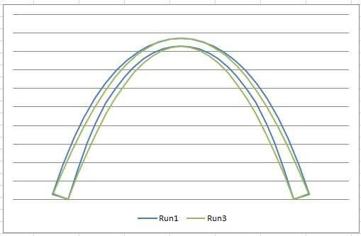
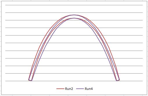
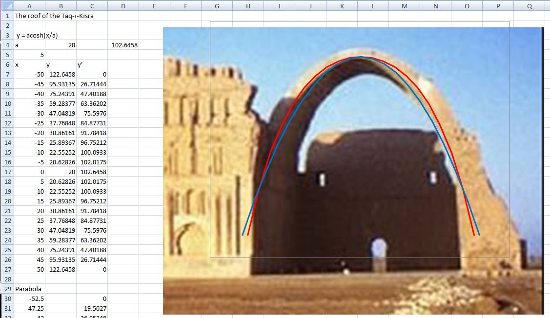
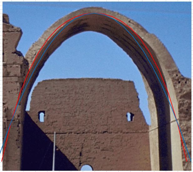
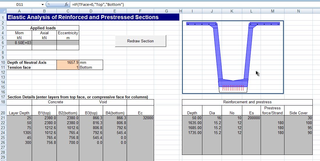
For these reasons the use of an XY graph can be a good option for many purposes, and this post provides two alternatives for automatic scaling. A cross-section drawing of an Australian “Super-T” bridge girder is used for illustration purposes. The two figures below show the results of plotting the cross section using auto scaling. The edge coordinates have been plotted using one XY range (with point markers hidden), and the reinforcement and prestressing strands have been plotted from coordinates in a second range, hiding the connector lines, and choosing the point marker symbol closest to a circle. It can be seen that both images are distorted to fill the available space.


The simplest way to get approximately equal scaling in the X and Y directions is to ensure that the plot range is square, then plot an additional line so that the smaller range is stretched to match the larger one. This line is allocated its own data range, and has both the line and data markers hidden.
The coordinates of the ends of the scale line are calculated as follows:
XLength = MAX(xrange) – MIN(xrange)
YLength = MAX(yrange) – MIN(yrange)
AddX = MAX((YLength – XLength)/2, 0)
AddY = MAX((XLength – YLength)/2, 0)
Scale Line Coordinates:
Start: MIN(xrange) – AddX, MIN(yrange) – AddY
End: MAX(xrange) + AddX, MAX(yrange) + AddY
The results of adding the scale line are shown in the two figures below. Advantages of this method are that scaling is carried out automatically, and that no VBA is required. The main disadvantage is that if the plot area shape is changed from square the resulting image will be distorted.


The second method is to use VBA to adjust the range of the graph scales, so that the drawing will have the same scale in both directions regardless of the range of X and Y values, and the shape of the plot area. I have taken the macro to perform this task from Jon Peltier’s site:
http://peltiertech.com/Excel/Charts/SquareGrid.html
The code below has been slightly modified to plot the graph in the centre of the plot area, rather than to one side, or towards the bottom:
Sub MakePlotGridSquareOfActiveChart()

MakePlotGridSquare2 ActiveChart

End Sub
Sub MakePlotGridSquare2(myChart As Chart, Optional bEquiTic As Boolean = False)
‘ Code from http://peltiertech.com/Excel/Charts/SquareGrid.html
‘ Modified DAJ 31 May 08
Dim plotInHt As Integer, plotInWd As Integer
Dim Ymax As Double, Ymin As Double, Ydel As Double, YMid As Double, YHWidth As Double
Dim Xmax As Double, Xmin As Double, Xdel As Double, XMid As Double, XHWidth As Double
Dim Ypix As Double, Xpix As Double
With myChart
‘ get plot size
With .PlotArea
plotInHt = .InsideHeight
plotInWd = .InsideWidth
End With
‘ Set axes to auto
With .Axes(xlValue)
.MaximumScaleIsAuto = True
.MinimumScaleIsAuto = True
‘ .MajorUnitIsAuto = True
End With
With .Axes(xlCategory)
.MaximumScaleIsAuto = True
.MinimumScaleIsAuto = True
‘ .MajorUnitIsAuto = True
End With
Do
‘ Get axis scale parameters and lock scales
With .Axes(xlValue)
Ymax = .MaximumScale
Ymin = .MinimumScale
Ydel = .MajorUnit
.MaximumScaleIsAuto = False
.MinimumScaleIsAuto = False
.MajorUnitIsAuto = False
End With
With .Axes(xlCategory)
Xmax = .MaximumScale
Xmin = .MinimumScale
Xdel = .MajorUnit
.MaximumScaleIsAuto = False
.MinimumScaleIsAuto = False
.MajorUnitIsAuto = False
End With
If bEquiTic Then
‘ Set tick spacings to same value
Xdel = WorksheetFunction.Max(Xdel, Ydel)
Ydel = Xdel
.Axes(xlCategory).MajorUnit = Xdel
.Axes(xlValue).MajorUnit = Ydel
End If
‘ Pixels per unit
Ypix = plotInHt * Ydel / (Ymax – Ymin)
Xpix = plotInWd * Xdel / (Xmax – Xmin)
‘ Keep plot size as is, adjust scale width
If Xpix > Ypix Then
XMid = (Xmax + Xmin) / 2
XHWidth = (plotInWd * Xdel / Ypix) / 2
.Axes(xlCategory).MaximumScale = XMid + XHWidth
.Axes(xlCategory).MinimumScale = XMid – XHWidth
Else
YMid = (Ymax + Ymin) / 2
YHWidth = (plotInHt * Ydel / Xpix) / 2
.Axes(xlValue).MaximumScale = YMid + YHWidth
.Axes(xlValue).MinimumScale = YMid – YHWidth
End If
‘ Repeat if “something” else changed to distort chart axes
‘ Don’t repeat if we’re within 1%
Loop While Abs(Log(Xpix / Ypix)) > 0.01
End With
End Sub
The results of applying this code are shown below:


The advantage of this method is that it will work for any shape plot area, and will still work if the plot area is changed. The main disadvantage is that the macro needs to be re-run every time the graph data changes, but this could be accomplished by triggering the scale routine with a worksheetchange event.
This code was found via the Eng-tips forum (http://www.eng-tips.com/viewthread.cfm?qid=141275), where there are also some modified versions which switch on the axes display, then return them to their original state. I found that the original works works (at least in Excel 2007) whether the axes are displayed or not, so there did not seem to be any advantage in this refinement.