As well as Excel, the code shown in this post requires current versions of Python, Numpy, Matplotlib, and pyxll. The required import statements at the head of the Python code are:
import numpy as np

import matplotlib as mpl
import matplotlib.pyplot as plt
import mpl_toolkits.mplot3d.axes3d as axes3d
from matplotlib import colors

import pyxll
from pyxll import xl_func, xl_arg, xl_return, plot
The spreadsheets and Python code described below may be downloaded from Matplotlib3D.zip.
The last post on creating Matplotlib animations in Excel had examples of 3D plots which either plotted a single line, or a single surface defined by points on a regular grid. The code below is a simple example of the latter, using test data included in the Matplotlib library:
@xl_func
@xl_arg('rtn', 'int')
@xl_return("numpy_array")
def PlotWireFrame(val = 0.05, rtn = 2):
    fig = plt.figure()
    ax = fig.add_subplot(111, projection='3d')
    ax.set_title('Wireframe Plot')

    #getting test data
    X, Y, Z = axes3d.get_test_data(val)

    #drawing wireframe plot
    cb = ax.plot_wireframe(X, Y, Z, cstride=10,
                            rstride=10, color="green")

    plot(cb)
    dat = X, Y, Z
    return dat[rtn]
This generates the graph below when called from Excel:

The Excel PlotWireFrame UDF generates the wireframe graph and also returns the data for the selected axis.
The plot_wireframe function plots a 3D surface, but for my purposes I more frequently need to plot a 3D frame with the following features:
- The plot should allow for a large number of straight line segments with any orientation and connections.
- It should be possible to plot different groups of elements with different colours.
- All three axes should be plotted to the same scale.
- It should be possible to specify the viewpoint angles and the centre and extent of the plotted image.
The code below performs this task. The input data is specified in two ranges:
- The lines are specified as separate straight line segments with a “material” number, start node number and end node number.
- The nodes are specified in a 3 column range with X Y and Z coordinates.
The code combines all the lines of the same material into 3 arrays with X, Y and Z coordinates. Each line is specified with the start and end coordinates, then None, so that lines that are not connected are plotted with a gap between them:
@xl_func
@xl_arg('Nodes', 'numpy_array')
@xl_arg('Beams', 'numpy_array<int>')
@xl_arg('CenXYZ', 'numpy_array', ndim=1)
@xl_arg('ViewAng', 'numpy_array', ndim=1)
@xl_arg('DisplayAx', 'bool')
@xl_arg('Xrange', 'float')
@xl_arg('LineWidth', 'float')
def Plot3D(Nodes, Beams, ViewAng = None, CenXYZ = None, Xrange = 0., DisplayAx = False, LineWidth = 1):
    fig = mpl.figure.Figure()
    ax = axes3d.Axes3D(fig)

    ax.set_box_aspect([1, 1, 1])
    ax.set_proj_type('persp')

    # Set viewing angle if specified, or create axes with defaults
    try:
        ax = axes3d.Axes3D(fig, azim = ViewAng[0], elev = ViewAng[1]) # roll = ViewAng[2] to be added in next release
    except:
        ax = axes3d.Axes3D(fig)

    # Set axis limits
    if Xrange == 0:
        Xrange = (np.max(Nodes[:,0]) - np.min(Nodes[:,0]))/2
    rng = Xrange/2

    try:
        X, Y, Z = CenXYZ[0:3]
    except:
        X = (np.max(Nodes[:,0]) + np.min(Nodes[:,0]))/2
        Y = (np.max(Nodes[:,1]) + np.min(Nodes[:,1]))/2
        Z = (np.max(Nodes[:,2]) + np.min(Nodes[:,2]))/2

    ax.set_xlim3d(X-rng,X+rng)
    ax.set_ylim3d(Y-rng,Y+rng)
    ax.set_zlim3d(Z-rng, Z+rng)

    # Read beams and coordinates
    rows = Beams.shape[0]
    mats = np.max(Beams[:,0])
    nummata = np.zeros(mats, dtype = int)
    for i in range(0, mats):
        nummata[i] = np.count_nonzero(Beams[:,0] == i+1)

    colors =['tab:blue', 'tab:orange', 'tab:green', 'tab:red', 'tab:purple', 'tab:brown', 'tab:pink', 'tab:gray', 'tab:olive', 'tab:cyan']

    if DisplayAx == False:
        ax.set_axis_off()

    # Create lines for each material
    for mat in range(0, mats):
        rowsm = nummata[mat]
        rows2 = rowsm*3
        x_line = np.empty(rows2)
        y_line = np.empty(rows2)
        z_line = np.empty(rows2)
        matcol = np.mod(mat, 10)
        col = colors[matcol]
        j = 0
        for i in range(0, rows):
            if Beams[i, 0] == mat+1:
                n1 = Beams[i,1]-1
                n2 = Beams[i, 2]-1
                x_line[j] = Nodes[n1,0]
                x_line[j+1] = Nodes[n2,0]
                x_line[j+2] = None
                y_line[j] = Nodes[n1,1]
                y_line[j+1] = Nodes[n2,1]
                y_line[j+2] = None
                z_line[j] = Nodes[n1,2]
                z_line[j+1] = Nodes[n2,2]
                z_line[j+2] = None
                j = j+3

        ax.plot3D(x_line, y_line, z_line, col, linewidth=LineWidth)
    plot(ax)
The code was checked by plotting three circles centred at the origin and with radius 10, in the XY, XZ, and YZ planes:

The default plot looks along the X axis with the Y axis to the right, and the Z axis vertical. In the next plot the view point is rotated 45 degrees about the Z axis (azimuth), with a vertical deflection of 30 degrees:

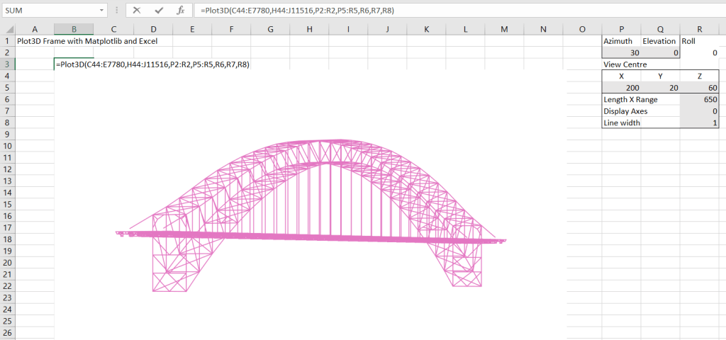
The next example shows a much more complex plot; a 3D image of the Sydney Harbour Bridge with the axes display turned off and the line width reduced to 1:

The data for this image was taken from a Strand7 file, available from the Strand7 web site to licenced Strand7 users. The top of the data range is shown below. In all there are 11,473 beams and 7737 nodes.

The next example shows the same data with a different view angle and centre coordinates:

Finally the same data viewed in the Strand7 FEA program, showing a very similar image to the Matplotlib/Excel plot with the same view angles:

The current Matplotlib code does not allow for rotation about the line of sight (“roll”), but this feature is under development and is expected to be included in the next release.

Pingback: 3D plots with the latest Matplotlib | Newton Excel Bach, not (just) an Excel Blog
Pingback: Scipy Functions with Excel and pyxll 9 – Special, distance, space and constants functions and FFT | Newton Excel Bach, not (just) an Excel Blog