Excel functions that return references and new functions

The MyOnlineTrainingHub blog recently posted an article on:

Excel Functions that Return References

As well as comprehensive advice on the use of OFFSET, INDEX, CHOOSE, IF and INDIRECT, it also covers the new functions XLOOKUP (Excel for Microsoft 365 only), and IFS and SWITCH (new in Excel 2019).  There is also a worksheet for free download, including all the examples given in the article.

Posted in Arrays, Excel | Tagged , , , , , , , , , | 1 Comment

XY Chart problems – 2

The previous chart post (XY Chart problems – 1) looked at problems plotting charts with very short data ranges.  An associated problem is plotting XY charts with data with gaps (see When is an XY chart not an XY chart …? and Plotting Charts With Gaps), using array data returned from VBA or an array function.  In the latest release of Excel there is now a simpler solution to this problem, illustrated in the screen-shots below.

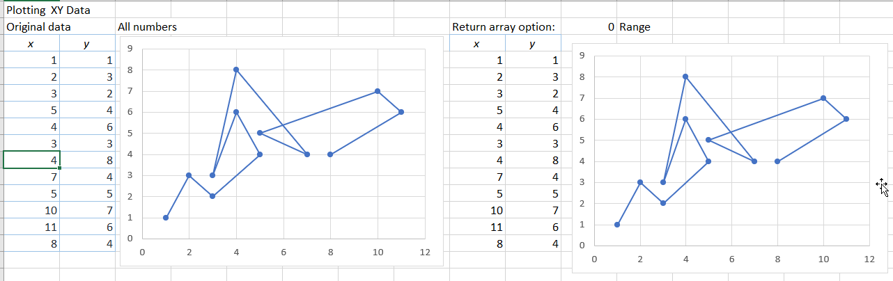
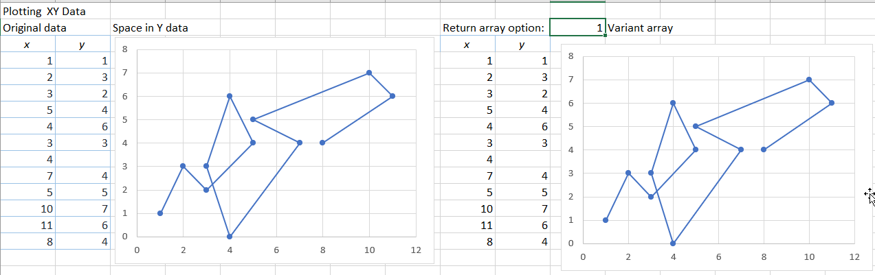
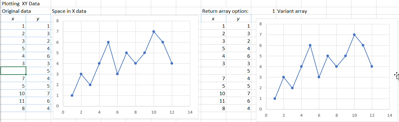
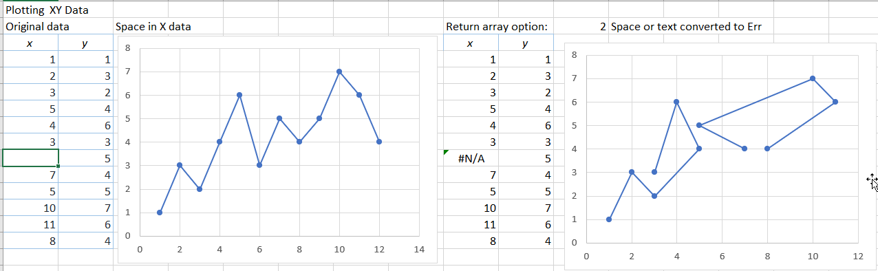
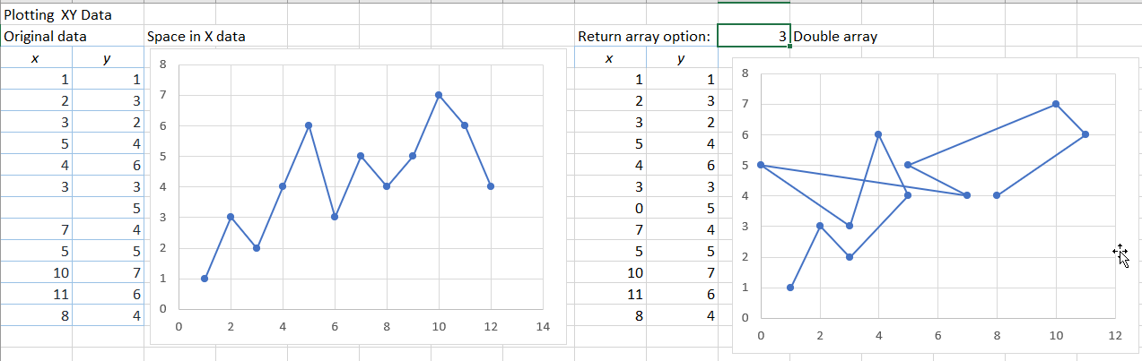
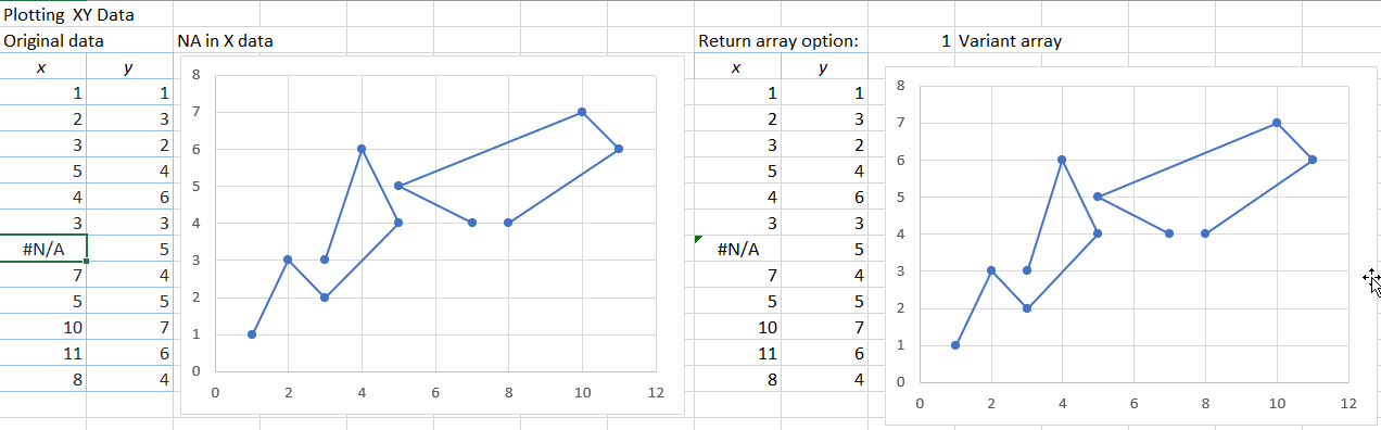
The graphs on the left show plots of the XY data in Columns A and B.  The graphs on the right plot the same data, as returned by a VBA user defined function (UDF), with various options for the data format of the returned data.

The original data plots a continuous line, which displays the same in both graphs:

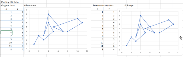
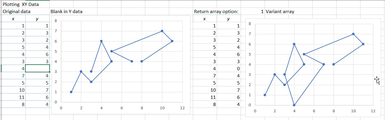
If the Y data includes a blank cell the graph on the left displays with a gap in the line, but if the data is returned from VBA as a variant array (or a range) the blank cell is converted to a value of 0:

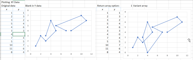
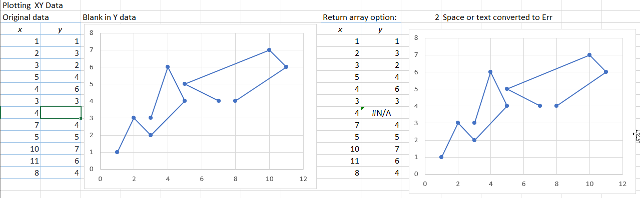
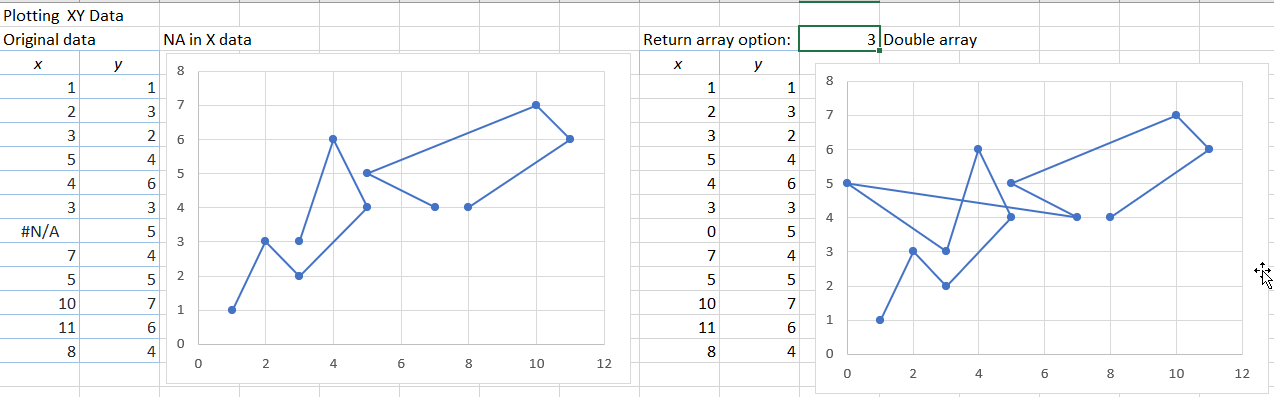
If the empty cell is converted to a #N/A value (using VBA CVErr(xlErrNA)), the cell now plots as a gap:

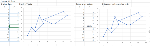
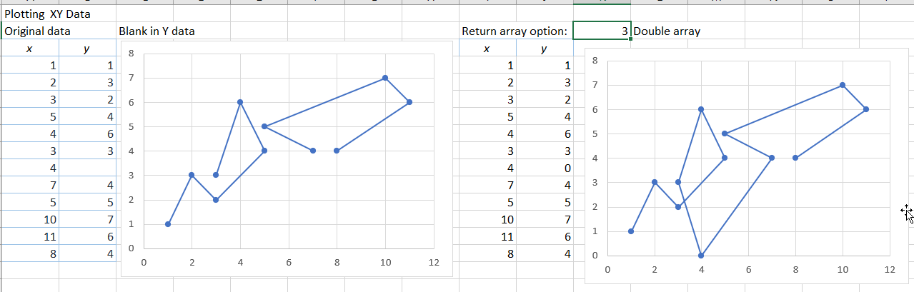
If the VBA array is declared as a Double array the #N/A value will not be accepted, and blank cells are returned as 0:

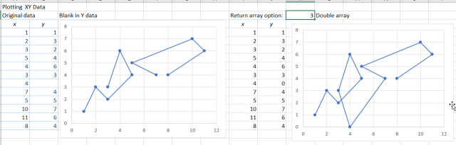
If any cell in the Y range contains a space, or any other text, that cell will plot as a zero value, both directly and when returned as a variant array from VBA:

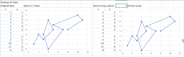
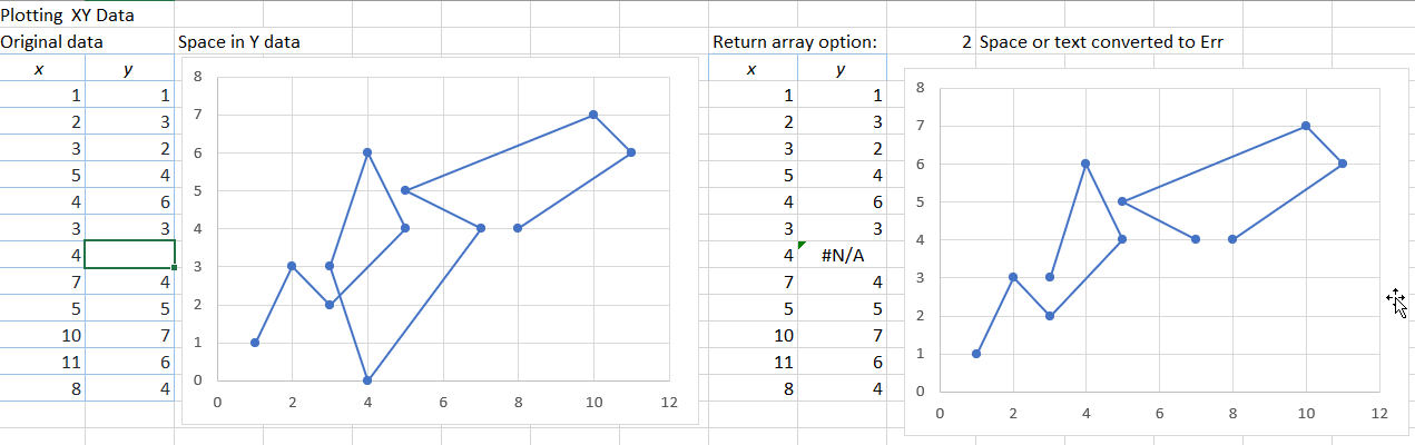
Converting the text to an error value in VBA, the graph displays with a gap:

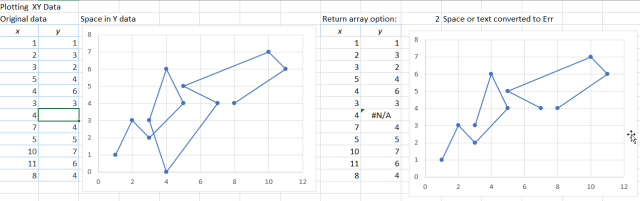
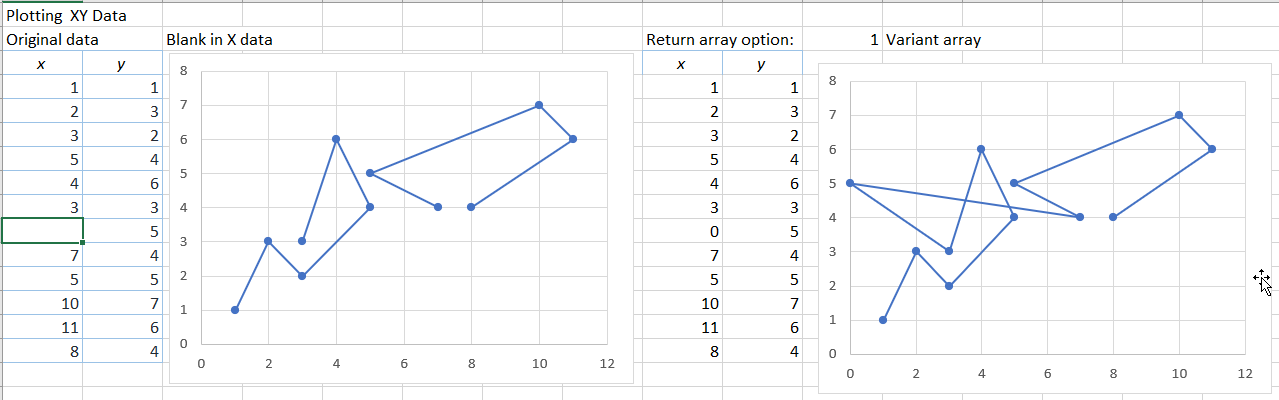
A blank cell in the X column displays the same as in the Y column; as a gap when ploted directly on the spreadsheet and as 0 when returned as a Variant array from VBA:

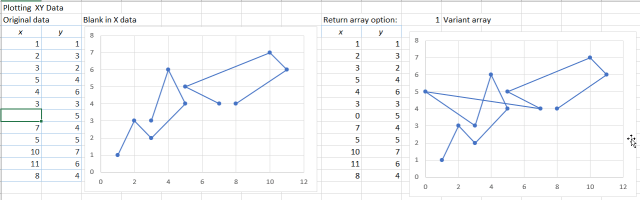
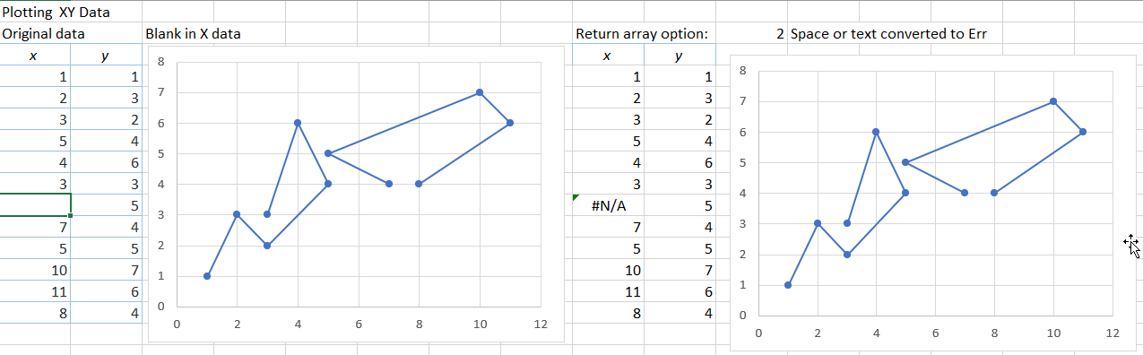
Converting the blank to a #N/A value in VBA now displays as a gap:

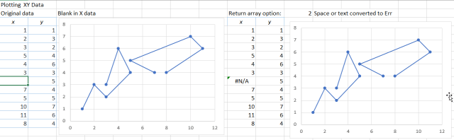
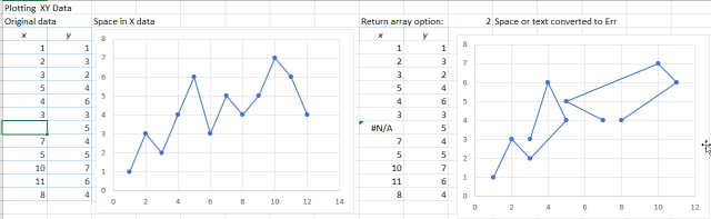
A space (or other text) in the X data results in the XY chart displaying as a Line chart:

Converting the text to #N/A in VBA returns the graph to XY format, with a gap:

If the data is converted to a double array in VBA, with the text cell converted to a zero, the chart will display in correct XY format, but with a zero X value, rather than a gap:

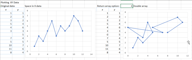
The correct display can be returned to both graphs by entering the #N/A value on the spreadsheet, and returning the data from VBA as a variant array:

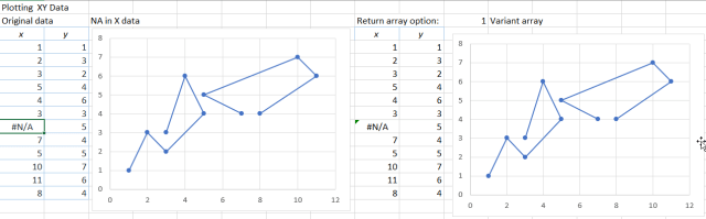
As previously, using a Double array in VBA will not allow the #N/A value to be returned from VBA.

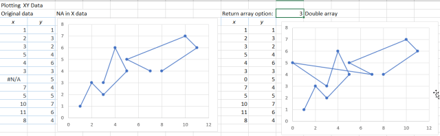
A spreadsheet including the chart and the VBA function (as well as the charts from the previous XY graph post) can be downloaded from: XY chart bug.zip.

Posted in Arrays, Charts, Charts, Excel, UDFs, VBA | Tagged , , , , , , | Leave a comment

The Drover’s Boy

Ted Egan

Posted in Bach | Tagged , | Leave a comment

XY Chart problems – 1

I have looked at problems with XY charts displaying as Line charts previously at:
When is an XY chart not an XY chart …? and
Plotting Charts With Gaps …

The charts shown below. and also in the next post, can be downloaded from:
XY chart bug.xlsb

This post summarises problems associated with section of the plot range, in response to an Eng-Tips question, regarding problems plotting an XY chart with two rows of data.

This is an example of an Excel bug that has been there for ever, and for some reason many people don’t even see it as a bug. You want to plot an XY graph (known to Excel as a scatter graph, even when displaying the data as lines), but if Excel sees any hint that the data is actually a “line graph” (i.e. the X values are not plotted to scale, but with equal spacing for each point), it will convert it to a line graph for you without asking. Also if the number of columns is equal to or greater than the number of rows it will treat the data series as being in rows rather than columns. The screenshot below illustrates these problems:

The top left graph was generated by selecting a “Line Chart” as the graph type, with range C4:D6 selected.

Top right had the same selected range, but I selected “Scatter (XY)” as the graph type. It has converted it into a Line Chart, but with the series names converted into sequence numbers (but with values displaying as decimals rather than integers!).

For lower middle I selected range C5:D6 (i.e. without the header row) and chose Scatter (XY). This has now plotted as an XY graph, but with the data in rows rather than columns.

For lower right  I selected C5:D7 and Scatter. The data is now plotted correctly, but it has decided that the text in cell D4 is the graph title.

For the lower left chart I selected C5:D6 and chose Scatter (XY), then reselected the data. If you don’t select the header rows when you generate the chart it leaves it as an XY graph with one data series, and you can re-select by drag and drop, or through the select data menu (if you prefer).

Posted in Charts, Charts, Excel | Tagged , , | 1 Comment

For Bert Jansch – Around the World in 80 Plays

I have been listening to Pierre le Bras on YouTube for some time, where he plays under the name of Old Picker.  Today a link from there led me to For Bert Jansch , hosted by The Bert Jansch Foundation:

Musicians around the globe are saluting the legendary guitarist and singer song-writer Bert Jansch who would have turned 75 in November 2018. A special guitar is travelling across continents from artist to artist, enabling them to connect with the man and his music.

Each chosen artist is playing something Bert-inspired. It might be a piece they have specially created, or their version of a Bert song – or something of their own that resonates with Bert’s music or his ecological and social concerns. Each musician sends their video here, to the Bert Jansch Foundation, before choosing the next artist who will receive the travelling guitar. Bert’s light is still riding high – as evidenced by these amazing artists and their tributes.

I have selected two examples; click on Around the World in 80 Plays for many more.

Anne Briggs (about whom Richard wrote his iconic song “Beeswing”) taught Bert Blackwaterside. Richard says he first heard it played by Bert in a folk club and has since performed it throughout his career both solo and with colleagues such as Sandy Denny. He adds: “Bert could take the blues and jazz and traditional British folk music and blend those together into a style. He was also a great songwriter.”

Pierre calls himself ‘a lucky bum’ who has been able to make music his whole life. He bought his first guitar in 1961 when The Shadows were the craze – even in France! He was soon listening to American folk and blues music. Once he heard Bert and John Renbourn, he says everything else became redundant. He started transcribing straight away. He used to visit London 2 or 3 times a year in the ’60s to buy records and go to hear them at the folk clubs. Pierre spent a decade in the ’70s and ’80s in Arizona gigging in bars, coffee shops and hotels, before returning to France.

Posted in Bach | Tagged , , , , , , | 1 Comment