If you need another reason to attend Excel Summit South, watch this video, and discover that mobile phones are spreadsheets all the way down.

If you need another reason to attend Excel Summit South, watch this video, and discover that mobile phones are spreadsheets all the way down.
I was going to write a reminder about the Excel Summit South, but Jeff Weir beat me to it, and since his version is way more entertaining than mine was going to be, pop over and find out why Jeff Weir is going the Excel Summit South (and why you should too).
One thing he got wrong though. He thinks the traffic in Auckland is bad. He should have a look at Sydney.

Xlwings is another free and open source package allowing communication between Excel and Python. It now incorporates ExcelPython, and is included in the Anaconda Python package, so will support my ExcelPython based spreadsheets after installation of xlwings using:
conda install xlwings
See http://docs.xlwings.org/installation.html for more details.
In this post I will look at using Matplotlib to plot graphs in Excel. A free download of a spreadsheet with all examples and all VBA and Python code can be found at:
The first example comes from the xlwings sample files, mpl.xlsm and mpl.py :

The VBA code couldn’t be simpler:
Sub Streamplot()
    RunPython ("import xlMatPlot; xlMatPlot.main()")
End Sub
The python code (that generates the graph) is also fairly straightforward (note: code updated for xlwings 0.9 and later, 7 May 2017):
import numpy as np
import matplotlib.pyplot as plt
import xlwings as xw
try:
    import seaborn
except ImportError:
    pass

def get_figure(const):
    # Based on: http://matplotlib.org/users/screenshots.html#streamplot
    Y, X = np.mgrid[-3:3:100j, -3:3:100j]
    U = -1 + const * X**2 + Y
    V = 1 - const * X - Y**2

    fig, ax = plt.subplots(figsize=(6, 4))
    strm = ax.streamplot(X, Y, U, V, color=U, linewidth=2, cmap=plt.cm.autumn)
    fig.colorbar(strm.lines)
    return fig


def main():
    # Create a reference to the calling Excel Workbook
    wb = xw.Workbook.caller()

    # Get the constant from Excel
    const = xw.Range('B1').value

    # Get the figure and show it in Excel
    fig = get_figure(const)
    sht = xw.Book.caller().sheets[0]
    sht.pictures.add(fig, name='MyStreamplot', update = True)
The get_figure function generates a matplotlib graph, using the const value passed from the main function. The main function creates a reference to the calling Excel Workbook, then assigns the graph to the named Excel graphic object ‘MyStreamplot’. If this already exists, it will be updated to display the newly created graphic. If not, it will be created.
I have modified the xlwings code to display a range of different graphs, based on examples taken from http://kestrel.nmt.edu/~raymond/software/python_notes/paper004.html
The VBA code has been modified to update the graph whenever there is a change to the “Samples” worksheet:

The main function in the xlMatPlot Python module now reads the required figure number from the Excel named range ‘fig_no’, and the constant (for Figure 1) from the range ‘n’. One of 10 functions are then called, depending on the value in ‘fig_no’.
Fig_no 2 generates a plot of sine and cos functions, together with some simple formatting and addition of text:
...
def get_figure2():
    x =     linspace(0., 10., 200)
    y =     sin(x)
    y2 =     cos(x)
    fig = plt.figure()   # Make a new figure

    line1=plt.plot(x, y)
    line2=plt.plot(x, y2, 'b')
    plt.setp(line1, color='r', linewidth=3.0)
    plt.setp(line2, color='b', linewidth=2.)
    plt.axis([0,10,-1.5,1.2])
    xl = plt.xlabel('horizontal axis')
    yl = plt.ylabel('vertical axis')
    ttl = plt.title('sine function')
    txt = plt.text(0,1.3,'here is some text')
    ann = plt.annotate('a point on curve',xy=(4.7,-1),xytext=(3,-1.3), arrowprops=dict(arrowstyle='->'))

    plt.grid(True)
    return fig
...

Fig_no 3 plots four functions, assigning a different line style to each:
...
def get_figure3():
    fig = plt.figure()
    x = arange(0.,10,0.1)
    a = cos(x)
    b = sin(x)
    c = exp(x/10)
    d = exp(-x/10)
    la = plt.plot(x,a,'b-',label='cosine')
    lb = plt.plot(x,b,'r--',label='sine')
    lc = plt.plot(x,c,'gx',label='exp(+x)')
    ld = plt.plot(x,d,'y-', linewidth = 5,label='exp(-x)')
    ll = plt.legend(loc='upper left')
    lx = plt.xlabel('xaxis')
    ly = plt.ylabel('yaxis')
    return fig
...

In Fig_no 4 there are four sub-plots generated in the one image:
...
def get_figure4():
    fg = plt.figure(figsize=(10,8))
    adj = plt.subplots_adjust(hspace=0.4,wspace=0.4)

    sp = plt.subplot(2,2,1)
    x = linspace(0,10,101)
    y = exp(x)
    l1 = plt.semilogy(x,y,color='m',linewidth=2)
    lx = plt.xlabel("x")
    ly = plt.ylabel("y")
    tl = plt.title("y = exp(x)")

    sp = plt.subplot(2,2,2)
    y = x**-1.67
    l1 = plt.loglog(x,y)
    lx = plt.xlabel("x")
    ly = plt.ylabel("y")
    tl = plt.title("y = x$^{-5/3}$")

    sp = plt.subplot(2,2,3)
    x = arange(1001)
    y = mod(x,2.87)
    l1 = plt.hist(y,color='r',rwidth = 0.8)
    lx = plt.xlabel("y")
    ly = plt.ylabel("num(y)")
    tl = plt.title("y = mod(arange(1001),2.87)")

    sp = plt.subplot(2,2,4)
    l1 = plt.hist(y,bins=25,normed=True,cumulative=True,orientation='horizontal')
    lx = plt.xlabel("num(y)")
    ly = plt.ylabel("y")
    tl = plt.title("cumulative normed y")
    return fg ...

Figures 5 to 8 illustrate variations on contour plots, not available directly from Excel. The basic graph is generated in Figure 5:
...
def get_figure5():
    fig = plt.figure()
    x = linspace(0,10,51)
    y = linspace(0,8,41)
    (X,Y) = meshgrid(x,y)
    a = exp(-((X-2.5)**2 + (Y-4)**2)/4) - exp(-((X-7.5)**2 + (Y-4)**2)/4)
    c = plt.contour(x,y,a)
    l = plt.clabel(c)
    lx = plt.xlabel("x")
    ly = plt.ylabel("y")

    return fig
...

Figures 6 to 8 illustrate various display options:
...
def get_figure6():
    fig = plt.figure()
    x = linspace(0,10,51)
    y = linspace(0,8,41)
    (X,Y) = meshgrid(x,y)
    a = exp(-((X-2.5)**2 + (Y-4)**2)/4) - exp(-((X-7.5)**2 + (Y-4)**2)/4)

    c = plt.contour(x,y,a,linspace(-1,1,11),colors='r',linewidths=4, linestyles='dotted')
    lx = plt.xlabel("x")
    ly = plt.ylabel("y")
    return fig ...

...
def get_figure7():
    fig = plt.figure()
    x = linspace(0,10,51)
    y = linspace(0,8,41)
    (X,Y) = meshgrid(x,y)
    a = exp(-((X-2.5)**2 + (Y-4)**2)/4) - exp(-((X-7.5)**2 + (Y-4)**2)/4)

    c = plt.contourf(x,y,a,linspace(-1,1,11))
    b = plt.colorbar(c, orientation='vertical')
    lx = plt.xlabel("x")
    ly = plt.ylabel("y")
    ax = plt.axis([0,10,0,8])
    return fig
...

...
def get_figure8():
    fig = plt.figure()
    x = linspace(0,10,51)
    y = linspace(0,8,41)
    (X,Y) = meshgrid(x,y)
    a = exp(-((X-2.5)**2 + (Y-4)**2)/4) - exp(-((X-7.5)**2 + (Y-4)**2)/4)
    ac = 0.25*(a[:-1,:-1] + a[:-1,1:] + a[1:,:-1] + a[1:,1:])
    c = plt.pcolor(x,y,ac)
    d = plt.colorbar(c,orientation='horizontal')
    q = plt.winter()
    e = plt.contour(x,y,a,linspace(-1,1,11),colors='k')
    lx = plt.xlabel("x")
    ly = plt.xlabel("y")
    return fig
...

Figure 9 illustrates a vector plot, also not available directly from Excel:
...
def get_figure9():
    fig = plt.figure()
    x = linspace(0,10,11)
    y = linspace(0,15,16)
    (X,Y) = meshgrid(x,y)
    u = 5*X
    v = 5*Y
    q = plt.quiver(X,Y,u,v,angles='xy',scale=1000,color='r')
    p = plt.quiverkey(q,1,16.5,50,"50 m/s",coordinates='data',color='r')
    xl = plt.xlabel("x (km)")
    yl = plt.ylabel("y (km)")
    return fig
...

The final example from http://kestrel.nmt.edu/~raymond/software/python_notes/paper004.html is a combination plot. See the link for additional background information and useful links.
...
def get_figure10():
    x = arange(0.,10.1,0.2)
    a = sin(x)
    b = cos(x)
    fig1 = plt.figure(figsize = (8,8))
    plt.subplots_adjust(hspace=0.4)
    p1 = plt.subplot(2,1,1)
    l1 = plt.plot(x,a)
    lx = plt.xlabel("x (km)")
    ly = plt.ylabel("y (m)")
    ttl = plt.title("sine")
    p2 = plt.subplot(2,1,2)
    l2 = plt.plot(x,b)
    lx = plt.xlabel("x (km)")
    ly = plt.ylabel("y (m)")
    ttl = plt.title("cosine")
    sttl = plt.suptitle("two plots")
    return fig1 ...

The remaining examples show how Matplotlib can be used to plot a function entered as text on the spreadsheet, without having to generate a table of values in the spreadsheet. This can also be done directly from Excel (although the procedure is not obvious, see Charting a function), but using Matplotlib also provides access to all the additional functionality of this program.
Here is the Python code:
def plotfunc():
# Get data from the spreadsheet
    wb = xw.Workbook.caller()
    func = xw.Range('PlotFunction', 'func').value
    var = xw.Range('PlotFunction', 'var').value
    if var == None: var = 'x'
    xrange = xw.Range('PlotFunction', 'x_range').value
    xmin = xrange[0]
    xmax = xrange[1]
    xnum = int(xrange[2])
    yrange = xw.Range('PlotFunction', 'y_range').value
    params = xw.Range('PlotFunction', 'params').value
    vals = xw.Range('PlotFunction', 'vals').value
# Convert params from strings to variables with the value given in vals
    for param, val in zip(params, vals):
        if param != None:
            globals()[param] = val
        else:
            break
# Create array of x values
    x = linspace(xmin, xmax, xnum)
# Convert func to a lambda function and evaluate it for x
    lfunc = eval('lambda ' + var + ': ' + func)
    y = lfunc(x)
# Make a new figure and plot the results
    fig = plt.figure()
    line1=plt.plot(x, y)
    plt.setp(line1, color='r', linewidth=1.0)
    if yrange[0] == None:
        ymin = amin(y)
    else:
        ymin = yrange[0]
    if yrange[1] == None:
        ymax = amax(y)
    else:
        ymax = yrange[1]
    xrng = xmax-xmin
    xmin = xmin - xrng * .05
    xmax = xmax + xrng * .05
    yrng = ymax - ymin
    if yrange[0] == None: ymin = ymin - yrng * .05
    if yrange[1] == None: ymax = ymax + yrng * .05
    plt.axis([xmin,xmax, ymin, ymax])
    xl = plt.xlabel('X')
    yl = plt.ylabel('Y')
    ttl = plt.title(func)
    plt.grid(True)

    sht = xw.Book.caller().sheets[1]
    sht.pictures.add(fig, name='MyFuncplot', update = True)
The VBA code simply calls the plotfunc function from the xlMatPlot Python code:
Private Sub Worksheet_Change(ByVal Target As Range)
    RunPython ("import xlMatPlot; xlMatPlot.plotfunc()")
End Sub
This code is located in the PlotFunction Worksheet code and will run whenever a value on the PlotFunction worksheet changes.
The first example shows a plot of a fourth order polynomial:

The remaining examples plot an oscillating function that was used as an example in recent presentations of integration functions:
exp(x) * sin(a*x**b)
With a = 2 and b = 3, plotting 1000 points with an x range of 1 to 3 produces a nice smooth result:

Increasing the maximum x to 10 greatly increases the number and range of the oscillations, with the result that 1000 points are clearly not enough to produce an accurate result.

Increasing the number of points to 100,000 gives a much better result, providing a visual illustration of the reason why it is difficult to get an accurate result when performing a numerical integration of this function. Note that the first time any Python code is called from a newly opened worksheet there is a noticeable delay while the code is imported and compiled, but thereafter the graph with 100,000 points should recalculate and re-plot in well under one second.

xlwins
For the last of the current series on combining Fortran, Python and Excel with F2PY and ExcelPython I have updated the xlSciPy spreadsheet to include two other variants of the Tanh-Sinh function:
The new version can be downloaded from:
and now includes all the Fortran source code (tsc.f90), as well as the compiled Fortran file, and Python and VBA code.
The Quad_TSi function input is the same as for Quad_TS, except that the limits range is replaced by a single value, a, the start of the integration interval.

The Quad_TSo function has an additional optional “omega” argument. For most functions use of the default value of 1 will give satisfactory results, but in some cases (such as Function 3 below) a different value will give greater precision with far fewer evaluations. I have not yet found any clear statement of how omega should be optimised, other than trial and error.

In modifying the original Fortran code to work with F2PY I found the following links very useful:
and for more information on the background to Tanh-Sinh Quadrature see:
Also, don’t forget the Tanh-Sinh Quadrature spreadsheets from Graeme Dennes posted here, which include VBA versions of all the functions presented here, and many more, together with examples of use in real applications:
The original code (available here) includes routines “intdeini” to generate an array of points and weights of the quadrature formula, and “intde” to carry out the integration of any supplied function “f”.
Modifications to intdeini (renamed getaw) were straightforward:
      subroutine getaw(lenaw, aw)
        implicit none
        integer lenaw
!f2py intent(in) lenaw
        real*8 aw(0:lenaw)
!f2py intent(out)  aw
        real*8 eps
        real*8 efs, hoff
        integer noff, nk, k, j
        real*8 pi2, tinyln, epsln, h0, ehp, ehm, h, t, ep, em, xw, wg
    ! ---- adjustable parameter ----
          efs = 0.1d0
          hoff = 8.45d0
    ! ------------------------------
          eps =   2.22044604925031E-16
          pi2 = 2 * atan(1.0d0)
          tinyln =  708.396418532264
...
The intde routine (renamed intde3) needed a little more work. The code below shows the f2py comment lines required to allow a python function to be called from the Fortran code:
      subroutine intde3(a, b, aw, x, lenaw)
      implicit none
!f2py intent(callback) f
      external f
      real*8 f
!     The following lines define the signature of func for F2PY:
!f2py real*8 y
!f2py y = fun(y)

      real*8 x(3)
!f2py intent(out) x

      integer lenaw
!f2py intent(in) lenaw
      real*8 aw(0:lenaw)
!f2py intent(in)  aw
      real*8 a, b
!f2py intent(in) a, b

...
The other major change was:
So lines in the original code such as:
...
        xa = ba * aw(j)
          fa = f(a + xa)
          fb = f(b - xa)
...
were replaced with:
...
          xa = ba * aw(j)
          c = a + xa
          fa = f(c)
          c = b - xa
          fb = f(c)
...
Finally 11 short functions were added to the Fortran code for testing purposes:
 ...       real*8 function f1(x)
real*8 x
!f2py intent(in)  x
f1 = 1 / sqrt(x)
end function f1
...
The Fortran code in tsc2.f90 was then compiled in a form that could be accessed from Python using F2PY:
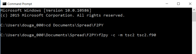
Open a Command Prompt window (right-click the Windows Icon and select Command Prompt)
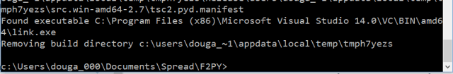
F2PY generates a large volume of text during the compilation process, but will terminate either with an error message, or if compilation was successful, with the message shown below:
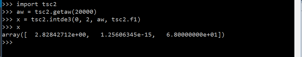
The resulting compiled file (tsc2.pyd) can be called from Python, in the same way as any other Python module:
To call from Excel(or from another Python function) it is convenient to create an interface function, to first call the getaw function, then pass the function to be integrated in alternative ways:
def Quad_TS(Func, limits, ftype, lenaw, var):
    res = np.zeros(6)
    stime = time.clock()
    x = np.zeros(3)
    a = limits[0]
    b = limits[1]

    try:
        aw[0] != 0.
    except:
        aw = tsc2.getaw(lenaw)

    stime2 = time.clock()
    if ftype == 0:
        c = tsc2.intde3(a, b, aw, tsc2.f1)
    elif ftype > 0:
        Func = getattr(tsc2, Func)
        c = tsc2.intde3(a, b, aw, Func)
    else:
        if ftype == -2: Func = 'lambda ' + var + ': ' + Func
        c = tsc2.intde3(a, b, aw, eval(Func))
    etime = time.clock()
    res[0] = c[0]
    res[1] = c[1]
    res[2] = c[2]
    res[3] = etime - stime2
    res[4] = etime - stime
    return res
The ftype argument currently has four options for the function to be integrated:
Finally the Python interface function (Quad-TS) is called from Excel, using Excel-Python:
Function Quad_TS(Func As String, Limits As Variant, Optional FType As Long = 1, Optional LenAW As Long = 11150, Optional VarSym As String = "x")
Dim Methods As Variant, Result As Variant, STime As Double, Rtn As Variant, IFunc As String, RunAW As Boolean
    On Error GoTo rtnerr
    STime = MicroTimer

    GetArray Limits, 1

    Set Methods = Py.Module(modname1)
    Set Result = Py.Call(Methods, "Quad_TS", Py.Tuple(Func, Limits, FType, LenAW, VarSym))

    Rtn = Py.Var(Result)
    Rtn(4) = MicroTimer - STime
    Quad_TS = Rtn
    Exit Function

rtnerr:
    Quad_TS = Err.Description

End Function
