I just discovered The Music Aficionado site, where Parts 1 and 2 of a series on the life and times of Danny Thompson have recently been posted:
I have been toying with the idea of writing an article about Danny Thompson for a while. His playing is a common thread across so many albums I cherish, that dedicating an artist profile article to him seemed inevitable. But where to begin, what to cover? There are over 400 album credits with his name on it, spanning almost six(!) decades. The task seemed monumental, given my inability to avoid digging deep into my chosen subjects. I finally decided to take the plunge and go for it. So here is the first article in a series (what else?) that will cover a few decades of his unique career. This one here is dedicated to his work in the 1960s.
The articles are detailed and very well written with many stories and YouTube links that I had not seen before (and many others I was happy to listen to again). See the articles at:
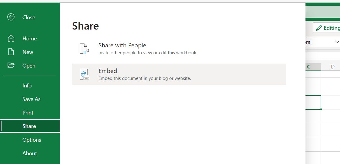
Every time I try to add a new link to a file on OneDrive in WordPress, it seems they have changed the system to stop it working. After much trial and error, the procedure given below works, for now.
Open the file in OneDrive on-line, and select File-Share-Embed:
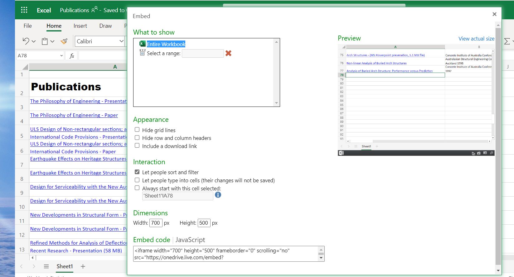
2. Select the desired display options, then click on the “Embed code” box, and copy the code to the clipboard:
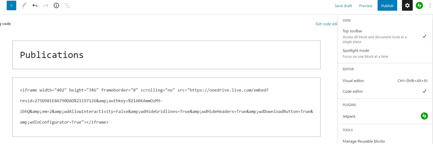
3. Return to the WordPress editor, click on the Options menu (top-right) and select Code Editor, then just paste the code generated in Excel:
You can then return to the Visual editor, and save the post complete with embedded spreadsheet.
I have recently updated my list of publications. Click on the “view full-size” icon in the bottom right corner for a full screen view, or click any link to download.
In late 2017 I posted Section Properties with MeshPY, including torsion and warping which looked at an Excel front end for Robbie van Leeuwen’s SectionProperties program, which provides facilities for calculation of section properties of complex shapes, including torsion and warping constants. Since then the development has moved to Github and there have been many updates to the code. I have now revised my spreadsheet and Python code to work with the latest version (1.08) and Python 3, using pyxll to link to the SectionProperties Python code:
With Windows 10 and Python 3.9 I found that Meshpy installed with pip with no problems, but installing Section-Properties with pip raised repeated errors. However simply downloading the code from GitHub, then copying the top level “sectionproperties” folder to my active pyxll code folder worked with no problems. (Update: installing with pip now works well, see SectionProperties update update)
The Excel spreadsheet provides access to the numerical section properties output for any of the 18 pre-defined shapes, or any custom shape. At this stage the graphical output is limited to plots of the geometry of the shapes. The next version of Section-Properties will be switching from Meshpy to the Triangle library for generation of the section meshes, and when that is released I will look at extending the plotting functionality in the spreadsheet.
The screenshots below show examples of the output with the current code:
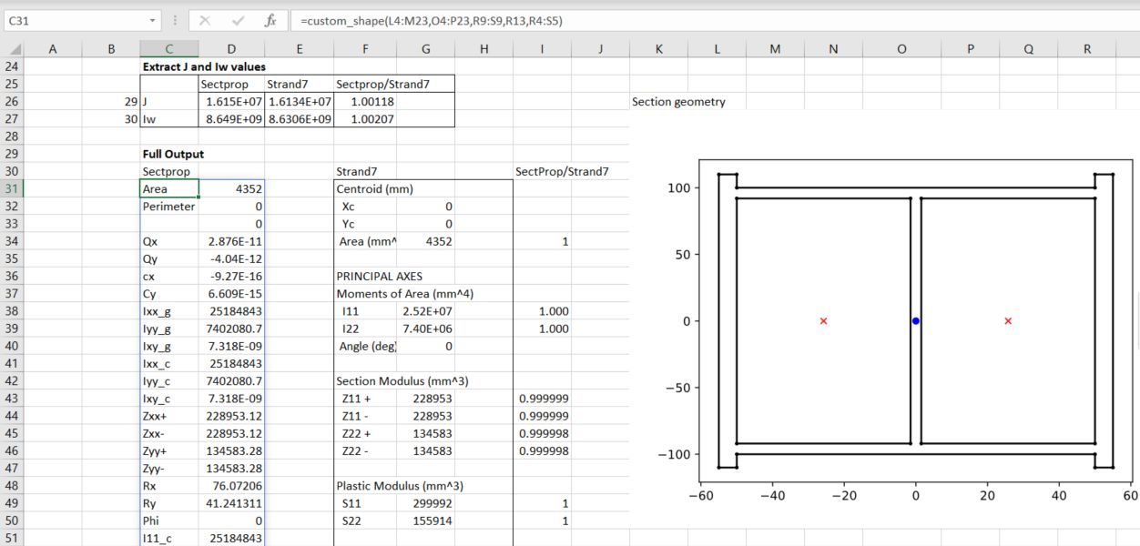
The first example is taken from the Section-Properties docs, with a hard-coded circular shape of diameter 50, divided into 64 segments. The results are compared with results from the Strand7 FEA package with the same shape:
The next example reads the section “points” and “facets” from the spreadsheet, and divides the shape into two regions, with different specified mesh-sizes:
The next sheet generates a shape from an Eng-Tips discussion:
The calculated section properties are compared with values from a Strand7 analysis, with very close agreement:
The Defined_Shapes sheet lists the 18 defined shapes, and uses the GetSect function to generate the section properties for a named shape. The full output list 64 properties, or an array of row numbers may be input to list the selected properties:
The cross-section graphic is generated with the same function, setting the final “out” argument to 10:
The procedures discussed in the previous post required the contour data to be arranged on a regular rectangular grid, with the data points listed in a 2D array. As far as I know there is no built in alternative in Excel, but Matplotlib provides functions that allow contour plots to be generated from data at random locations. Examples of two alternative methods are given at: Contour plot of irregularly spaced data
I have modified the code to plot the data in Excel, and to return two separate plots:
@xl_func
def contour_examples(out=1):

    np.random.seed(19680801)
    npts = 200
    ngridx = 100
    ngridy = 200
    x = np.random.uniform(-2, 2, npts)
    y = np.random.uniform(-2, 2, npts)
    z = x * np.exp(-x**2 - y**2)

    # fig, (ax1, ax2) = plt.subplots(nrows=2)
    if out == 1:
        fig, ax1 = plt.subplots()

        # -----------------------
        # Interpolation on a grid
        # -----------------------
        # A contour plot of irregularly spaced data coordinates
        # via interpolation on a grid.

        # Create grid values first.
        xi = np.linspace(-2.1, 2.1, ngridx)
        yi = np.linspace(-2.1, 2.1, ngridy)

        # Linearly interpolate the data (x, y) on a grid defined by (xi, yi).
        triang = tri.Triangulation(x, y)
        interpolator = tri.LinearTriInterpolator(triang, z)
        Xi, Yi = np.meshgrid(xi, yi)
        zi = interpolator(Xi, Yi)

        # Note that scipy.interpolate provides means to interpolate data on a grid
        # as well. The following would be an alternative to the four lines above:
        # from scipy.interpolate import griddata
        # zi = griddata((x, y), z, (xi[None, :], yi[:, None]), method='linear')

        ax1.contour(xi, yi, zi, levels=14, linewidths=0.5, colors='k')
        cntr1 = ax1.contourf(xi, yi, zi, levels=14, cmap="RdBu_r")

        fig.colorbar(cntr1, ax=ax1)
        ax1.plot(x, y, 'ko', ms=3)
        ax1.set(xlim=(-2, 2), ylim=(-2, 2))
        ax1.set_title('grid and contour (%d points, %d grid points)' %
                    (npts, ngridx * ngridy))
        pyxll.plot(fig)
        return 'Contour example1'
    else:

    # ----------
    # Tricontour
    # ----------
    # Directly supply the unordered, irregularly spaced coordinates
    # to tricontour.
        fig, ax2 = plt.subplots()

        ax2.tricontour(x, y, z, levels=14, linewidths=0.5, colors='k')
        cntr2 = ax2.tricontourf(x, y, z, levels=14, cmap="RdBu_r")

        fig.colorbar(cntr2, ax=ax2)
        ax2.plot(x, y, 'ko', ms=3)
        ax2.set(xlim=(-2, 2), ylim=(-2, 2))
        ax2.set_title('tricontour (%d points)' % npts)

        plt.subplots_adjust(hspace=0.5)
        # plt.show()
        pyxll.plot(fig)
        return 'Contour example2'
The resulting plots are identical to those from the original code, except that the axes are not plotted to scale:
Interpolate on a gridUse Matplotlib tricontour
The tricontour option has been used with the data from the simple FEA analysis used in the previous post, allowing the input data to include all the mid-side nodes. The code has also been modified to allow plotting to scale, and use of a Matplotlib colormap. The resulting plot is shown alongside the original Strand7 plot:
In the revised code the data is input as three 1D arrays, the plot width and height may be specified, or set height = 0 to plot to scale, and the number of contour levels, and any colormap may be specified:
A more complex example illustrates a problem with the tricontour function when plotting over an area with concave segments. The image below shows vertical deflections from a Strand7 analysis of a retaining wall with piled foundations:
The Matplotlib plot with the same data inserts an additional triangular area in front of the wall:
Limiting the plot to the region to the right of the wall face avoids this problem, and generates a plot closely matching the Strand7 output:
It seems that it is nor straightforward to create a contour plot on a shape with a concave boundary. The best information I could find was:
However, this may not solve all problems, particular where the problem is defined on an irregular domain. Also, in the case where the domain has one or more concave areas, the delaunay triangulation may result in generating spurious triangles exterior to the domain. In such cases, these rogue triangles have to be removed from the triangulation in order to achieve the correct surface representation. For these situations, the user may have to explicitly include the delaunay triangulation calculation so that these triangles can be removed programmatically. Under these circumstances, the following code could replace the previous plot code: