A mystery curve links to Jupyter

Reviewing some of my less visited links recently, I was intrigued by a post at The Math Less Travelled:

The previous post at the site provides more details of the source of the curve, and some links to an interactive curve generator written in Python, using the Jupyter Notebook. I hadn’t heard of the Jupyter Project, and I will certainly be taking a closer look in the future, but for now I thought I would have a go at creating the curve generator in Excel, which turned out to be surprisingly easy, with no coding required.

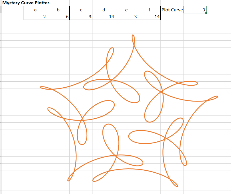
The curve is defined by the equation:
f(t) = e^{it} + \frac{1}{2} e^{6it} + \frac{i}{3} e^{-14it}
which looks fairly mysterious to a non-mathematician, but as explained at this Wikipedia article the function consists of three circles in the complex plane, which can be translated into the XY plane with two functions:
x(t) = cos(t) + cos(6t)/2 + cos(-14t)/3
y(t) = sin(t) + sin(6t)/2 + sin(-14t)/3

I have generated these values in Excel in three stages so each component of the curve can be plotted separately, and we can also add a fourth level, as shown in the screenshot below:

MCPlot5

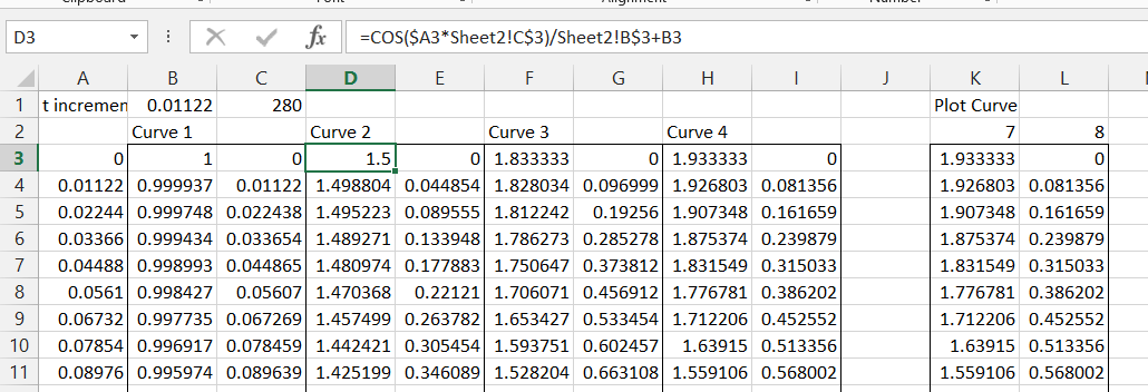
The t values in Colum A simply increment by the value in Cell B1 (set to pi/280 in this example).  The x and y values for Curve 1 are Cos(t) and Sin(t), and the values for Curve 2 (as shown in the formula bar for the x value) are:
=COS($A3*Sheet2!C$3)/Sheet2!B$3+B3
=SIN($A3*Sheet2!C$3)/Sheet2!B$3+C3

The links t0 Sheet2 allow the factors for the curve to be easily changed.  The formulas for Curve 2 can then be copied across for Curve 3, and an additional Curve 4 is added.  The formulas in Row 3 are then copied down as far as required.  Finally the actual values to be plotted are extracted in Colums K and L with:
=INDEX($B3:$I3,K$2)
=INDEX($B3:$I3,L$2)
which are also copied down to cover the full range.

Finally values are entered in the appropriate cells on Sheet 2, and the values in Columns K and L are plotted as an XY (Scatter) chart on Sheet 2, resulting in:

MCPlot1

We can now experiment with different curves simply by entering different values under a to f, and choosing which curve to plot. Entering the same factors as c and d under e and f, and selecting curve 4 generates:
MCPlot2

Changing the sign for factor f:

MCPlot3

And increasing the value of e:

MCPlot4

The spreadsheet can be downloaded from MysteryCurve.xlsx.
No open source code this time, because there is no code.
Feel free to add slider bars and animation!

Update:

If you wondered why my plot looks a bit different to the one in the link, it’s because I didn’t get the function right; the third term is multiplied by i/3, not 1/3.  That makes it a bit more complicated, but it can still be done in code-free in Excel.  I have updated the spreadsheet using the functions Complex(), IMProduct(), IMExp(), IMReal(), and Imaginary().  See the download spreadsheet for details, or just enjoy the corrected image below:

MCPlot6

Posted in Charts, Charts, Excel, Maths, Newton | Tagged , , , , , , | 2 Comments

ConBeamU 4.05 and ConBeampy 1.02

The latest update of the two continuous beam spreadsheets can be downloaded from:

The main changes are:

  • A problem with point loads applied exactly at a support position has been corrected
  • A function has been added to evaluate 3D end actions for a beam with any combination of 3D loading, any number of segments, and any combination of fixed or spring restraints at the ends.

The screen-shots below show the function input and output documentation, and example results:

REAct3D1-1

REAct3D1-2

REAct3D1-3

REAct3D1-4

The Python version requires an installed copy of Python, including Numpy and Scipy. All other required files are included.

Posted in Beam Bending, Excel, Finite Element Analysis, Frame Analysis, Link to Python, Newton, UDFs, VBA | Tagged , , , , , | 1 Comment

New and updated links

I have just updated my Blogroll, with 9 new links, and a couple of updates:

  • Colin Caprani’s site is now back on-line
  • I have updated the link to Jon Peltier’s blog
  • dataprose.org was the source of many of the new links, and also has excellent content on Excel, VBA, Access and dealing with data
  • Option Explicit describes itself as “A blog of Excel, Dashboards, Visual Basic for Applications, Data Analysis, Operations Research, and Visualizations”
  • TheSpreadsheetGuru has a wide range of tutorials on VBA, charts and general Excel topics.
  • Excelgaard not a blog, but an Excel site with a wide range of resources.
  • The Ken Puls (Excelguru) Blog has been going for approaching 10 years, and still has regular updates with excellent content
  • EXCELXOR has provided useful input for several topics discussed here over the past year or so.  Focusses on pushing the limits of what you can do on a spreadsheet without using VBA,
  • Mark Kubiszyn on the other hand focusses on what you can do with VBA
  • Datascopic is dedicated to Data Management and Excel as a tool for helping you get what you need from your data
  • Finally myOnlineTraininghub provides regular tutorials, and (like this site) is based in Australia.
Posted in Excel, UDFs, VBA | Tagged , , | Leave a comment

Google, artificial intelligence and the Daily Mail

The New Scientist tells me that the people at Google Labs are training their bots in natural language processing by feeding them text from the Daily Mail.

This raises two puzzling questions:

  1. How is it that those behind the Internet’s most successful search engine do not know of the Daily Mail Song?
  2. If in fact they do know of this song, how could they even start to think that analysis of this newspaper would be a useful step on the path towards artificial intelligence?

But anyway, re-visiting YouTube I find that views of Dan & Dan’s work have recently passed the 2 million mark, so congratulations to both of them.


Posted in Bach | Tagged , , , | Leave a comment

Section Properties – Lunes and Groups

Following a discussion at Eng-Tips and resulting comments I have updated my Section Properties spreadsheet to include calculation of the area and centroid of a “Lune” (the shape of a crescent moon).  I have also added a “Re-draw Shape” button because in at least one case the automatic re-draw was not working.  The download spreadsheet includes full open source code.

The screen-shot below shows the input and results for a Lune:

SectProp1-1

The results at the moment only include the angles of the two arc segments, the areas of the smaller radius segment and the lune, and the centroid position of the lune, measured from the centre of the larger arc.  The second moments of area can be calculated using the “Group” function, as shown below.

1.  Enter the section details (radius and arc angle from the x-axis, Theta) for the smaller radius circular segment, using Shape Type 4:

SectProp1-2

2.  Scroll down to the Group Properties table and enter the shape X offset as the offset between the two segments. The “Elastic Modulus” should be entered as 1.  After entering these details, click the “Create New Group” button:

SectProp1-3

3.  Enter the section details for the larger radius segment:

SectProp1-4

4.  Go back down to the Group Properties table, enter X offset as 0 and Elastic Modulus as -1 (so the shape properties are subtracted from the total) then click “Add shapes to group”.  The Group Properties table will update, including Ix and Iy values:

SectProp1-5

A similar procedure allows any combination of the standard shapes to be generated, including multiple copies of any shape with different offsets and/or rotations from the origin.  Shapes may also be rotated about their own centroid.


Posted in Drawing, Excel, Maths, Newton, VBA | Tagged , , , , | 2 Comments