The SectionProperties spreadsheets previously posted had limited graphics capabilities due to problems with the plotting routines causing Excel to crash. I have now fixed that problem by updating some Python libraries with pip:
- installing mkl-service
- numpy 1.21.2 -> 1.22.1
- Pillow 8.4.0 -> 9.0.0
- matplotlib 3.4.3 -> 3.5.1/
With these upgrades the SectionProperties plotting routines work without problems, and can be called from Excel using pyxll with the following code:
# Create section object
    geometry.create_mesh(mesh_sizes=meshSize)
    section = Section(geometry)
    section.calculate_geometric_properties()
    section.calculate_warping_properties()
    section.calculate_plastic_properties()

# Create matplotlib ax and fig:
    try:
        ax = section.plot_centroids( render = False)
        fig = ax.get_figure()
    except:
        return np.array([["Invalid geometry, check section dimensions"]])

# Plot in Excel
    pyxll.plot(fig)
The updated spreadsheet can be downloaded from:
See SectionProperties update update for details of other software required.
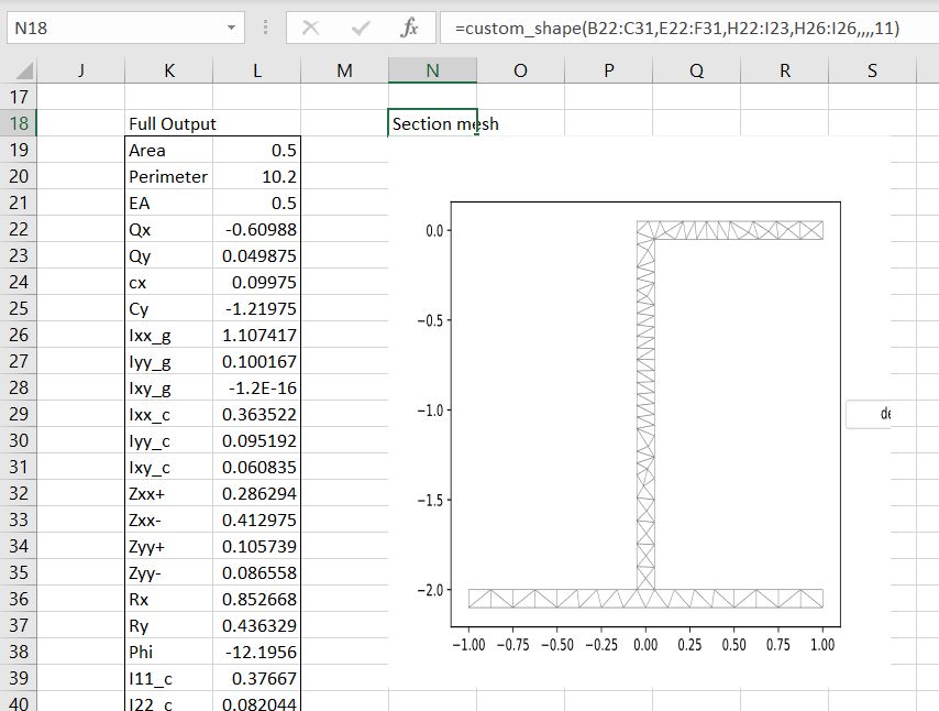
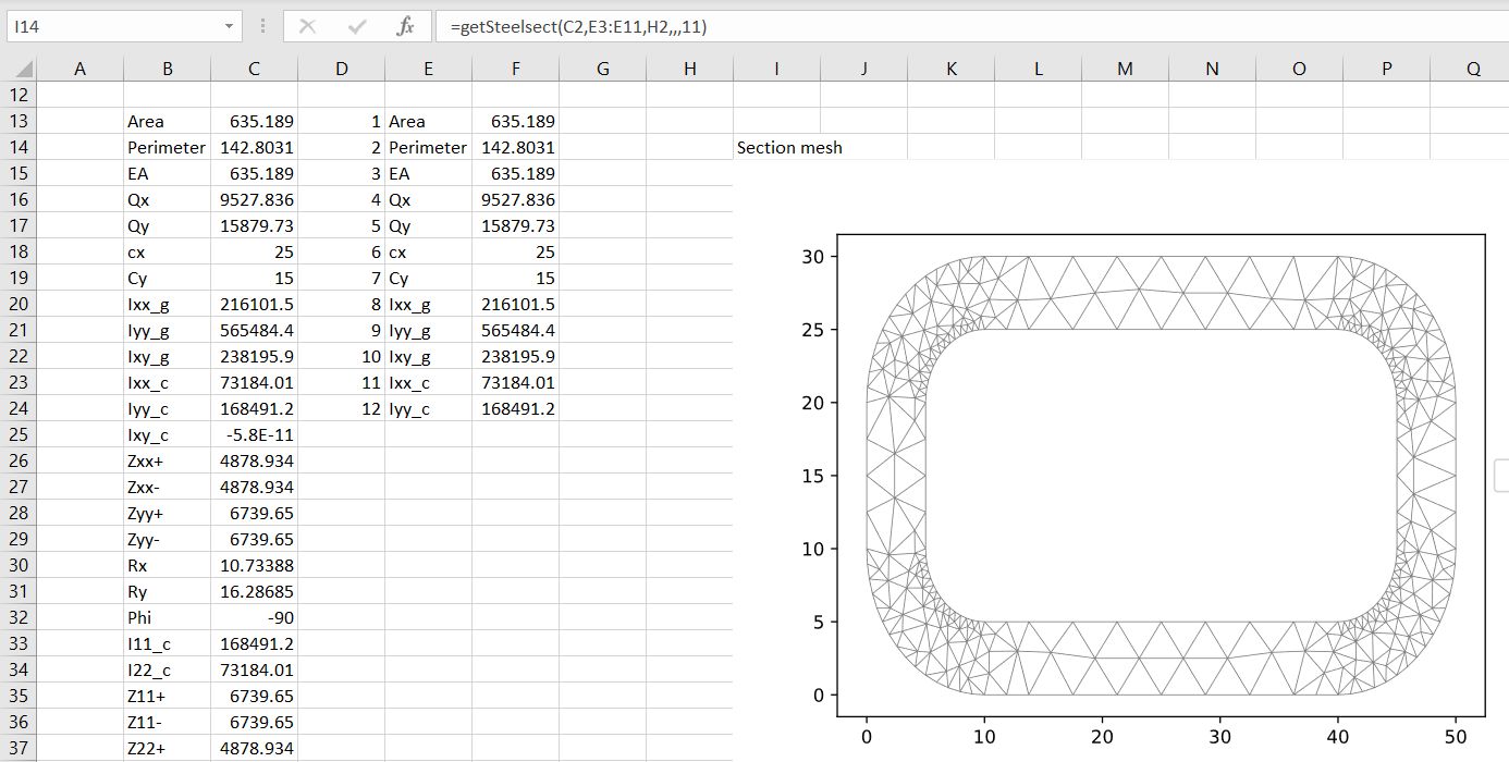
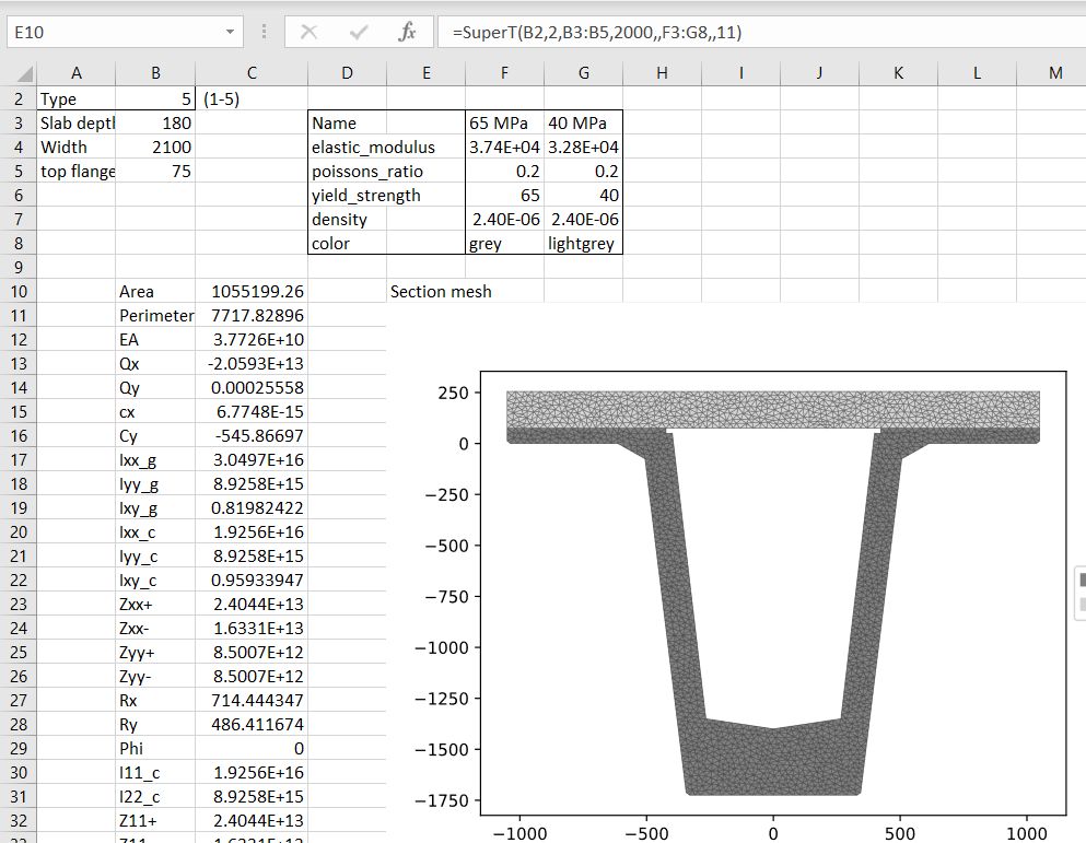
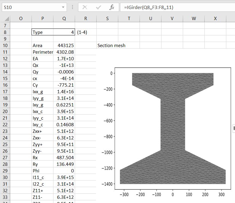
Examples of the new graphs: