In late 2017 I posted Section Properties with MeshPY, including torsion and warping which looked at an Excel front end for Robbie van Leeuwen’s SectionProperties program, which provides facilities for calculation of section properties of complex shapes, including torsion and warping constants. Since then the development has moved to Github and there have been many updates to the code. I have now revised my spreadsheet and Python code to work with the latest version (1.08) and Python 3, using pyxll to link to the SectionProperties Python code:
With Windows 10 and Python 3.9 I found that Meshpy installed with pip with no problems, but installing Section-Properties with pip raised repeated errors. However simply downloading the code from GitHub, then copying the top level “sectionproperties” folder to my active pyxll code folder worked with no problems. (Update: installing with pip now works well, see SectionProperties update update)
The Excel spreadsheet provides access to the numerical section properties output for any of the 18 pre-defined shapes, or any custom shape. At this stage the graphical output is limited to plots of the geometry of the shapes. The next version of Section-Properties will be switching from Meshpy to the Triangle library for generation of the section meshes, and when that is released I will look at extending the plotting functionality in the spreadsheet.
The screenshots below show examples of the output with the current code:
The first example is taken from the Section-Properties docs, with a hard-coded circular shape of diameter 50, divided into 64 segments. The results are compared with results from the Strand7 FEA package with the same shape:
The next example reads the section “points” and “facets” from the spreadsheet, and divides the shape into two regions, with different specified mesh-sizes:
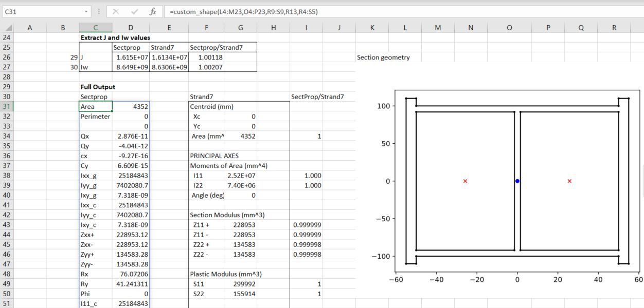
The next sheet generates a shape from an Eng-Tips discussion:
The calculated section properties are compared with values from a Strand7 analysis, with very close agreement:
The Defined_Shapes sheet lists the 18 defined shapes, and uses the GetSect function to generate the section properties for a named shape. The full output list 64 properties, or an array of row numbers may be input to list the selected properties:
The cross-section graphic is generated with the same function, setting the final “out” argument to 10:
The procedures discussed in the previous post required the contour data to be arranged on a regular rectangular grid, with the data points listed in a 2D array. As far as I know there is no built in alternative in Excel, but Matplotlib provides functions that allow contour plots to be generated from data at random locations. Examples of two alternative methods are given at: Contour plot of irregularly spaced data
I have modified the code to plot the data in Excel, and to return two separate plots:
@xl_func
def contour_examples(out=1):

    np.random.seed(19680801)
    npts = 200
    ngridx = 100
    ngridy = 200
    x = np.random.uniform(-2, 2, npts)
    y = np.random.uniform(-2, 2, npts)
    z = x * np.exp(-x**2 - y**2)

    # fig, (ax1, ax2) = plt.subplots(nrows=2)
    if out == 1:
        fig, ax1 = plt.subplots()

        # -----------------------
        # Interpolation on a grid
        # -----------------------
        # A contour plot of irregularly spaced data coordinates
        # via interpolation on a grid.

        # Create grid values first.
        xi = np.linspace(-2.1, 2.1, ngridx)
        yi = np.linspace(-2.1, 2.1, ngridy)

        # Linearly interpolate the data (x, y) on a grid defined by (xi, yi).
        triang = tri.Triangulation(x, y)
        interpolator = tri.LinearTriInterpolator(triang, z)
        Xi, Yi = np.meshgrid(xi, yi)
        zi = interpolator(Xi, Yi)

        # Note that scipy.interpolate provides means to interpolate data on a grid
        # as well. The following would be an alternative to the four lines above:
        # from scipy.interpolate import griddata
        # zi = griddata((x, y), z, (xi[None, :], yi[:, None]), method='linear')

        ax1.contour(xi, yi, zi, levels=14, linewidths=0.5, colors='k')
        cntr1 = ax1.contourf(xi, yi, zi, levels=14, cmap="RdBu_r")

        fig.colorbar(cntr1, ax=ax1)
        ax1.plot(x, y, 'ko', ms=3)
        ax1.set(xlim=(-2, 2), ylim=(-2, 2))
        ax1.set_title('grid and contour (%d points, %d grid points)' %
                    (npts, ngridx * ngridy))
        pyxll.plot(fig)
        return 'Contour example1'
    else:

    # ----------
    # Tricontour
    # ----------
    # Directly supply the unordered, irregularly spaced coordinates
    # to tricontour.
        fig, ax2 = plt.subplots()

        ax2.tricontour(x, y, z, levels=14, linewidths=0.5, colors='k')
        cntr2 = ax2.tricontourf(x, y, z, levels=14, cmap="RdBu_r")

        fig.colorbar(cntr2, ax=ax2)
        ax2.plot(x, y, 'ko', ms=3)
        ax2.set(xlim=(-2, 2), ylim=(-2, 2))
        ax2.set_title('tricontour (%d points)' % npts)

        plt.subplots_adjust(hspace=0.5)
        # plt.show()
        pyxll.plot(fig)
        return 'Contour example2'
The resulting plots are identical to those from the original code, except that the axes are not plotted to scale:
Interpolate on a gridUse Matplotlib tricontour
The tricontour option has been used with the data from the simple FEA analysis used in the previous post, allowing the input data to include all the mid-side nodes. The code has also been modified to allow plotting to scale, and use of a Matplotlib colormap. The resulting plot is shown alongside the original Strand7 plot:
In the revised code the data is input as three 1D arrays, the plot width and height may be specified, or set height = 0 to plot to scale, and the number of contour levels, and any colormap may be specified:
A more complex example illustrates a problem with the tricontour function when plotting over an area with concave segments. The image below shows vertical deflections from a Strand7 analysis of a retaining wall with piled foundations:
The Matplotlib plot with the same data inserts an additional triangular area in front of the wall:
Limiting the plot to the region to the right of the wall face avoids this problem, and generates a plot closely matching the Strand7 output:
It seems that it is nor straightforward to create a contour plot on a shape with a concave boundary. The best information I could find was:
However, this may not solve all problems, particular where the problem is defined on an irregular domain. Also, in the case where the domain has one or more concave areas, the delaunay triangulation may result in generating spurious triangles exterior to the domain. In such cases, these rogue triangles have to be removed from the triangulation in order to achieve the correct surface representation. For these situations, the user may have to explicitly include the delaunay triangulation calculation so that these triangles can be removed programmatically. Under these circumstances, the following code could replace the previous plot code:
Contour plots are widely used for a great variety of purposes, but facilities for producing them in Excel are very limited, and those that are provided are very well hidden. In this post I will look at some simple examples from the Python Matplotlib library, linking the input and resulting plots to Excel using pyxll, and compare with Excel’s capabilities for producing contour plots. The following post will look at some of the much more extensive facilities in Matplotlib.
The first example plot (below) is based on the Matplotlib documentation at: Matplotlib Contourf example modified to accept input of the X and Y data and the colour bar data from Excel:
The Python code accepts input of the X and Y data and the data required to generate the contour colours and ranges:
@xl_func()
@xl_arg('levels', 'float[]')
@xl_arg('colors', 'numpy_array<var>', ndim = 2)
def contour_plot_ex1(Xvals, Yvals, levels, colors):
    # Use Numpy meshgrid to convert the 1D input lists to 2D grids
    X, Y = np.meshgrid(Xvals, Yvals)

    # Calculate the Z array with Numpy functions
    Z1 = np.exp(-X**2 - Y**2)
    Z2 = np.exp(-(X - 1)**2 - (Y - 1)**2)
    Z = (Z1 - Z2) * 2

    # If the first element of colors is a string, extract the first column and convert to a list
    if isinstance(colors[0,0], str):
        colors = colors[:,0].tolist()
    else:
        colors = colors.tolist()
    fig,ax=plt.subplots(1,1)
    # Generate the contour plot with contourf, using contour bands specified in the levels list, and colours specified in colors
    cp = ax.contourf(X, Y, Z, levels=levels, extend='both', colors= colors)

    fig.colorbar(cp) # Add a colorbar to a plot
    ax.set_title('Filled Contours Plot')
    # Send to Excel with pyxll.plot
    pyxll.plot(fig)
    return "Contour Plot Example 1"
Input for the ‘levels’ and ‘colors’ arguments is shown in the screenshot below:
The X and Y data is listed in single column ranges (or in this case the same range for X and Y). ‘levels’ is a single column range listing the values for each contour boundary, and ‘colors’ may be a single column range with color codes, or a three or four column range specifying the color components (see Matplotlib documentation for details).
The contourf function can also be used as an alternative for plotting the Mandelbrot set (although it is much slower in generating the plot than the procedures used in previous posts):
A more practical example is plotting finite element analysis results, where we will compare Matplotlib alternatives and Excel contour plots with output from the FEA program Strand7. The first FEA example is a very simple 2D plane strain analysis with 6 rectangular plates, restrained horizontally along the two vertical edges, vertically and horizontally along the base, with a downward deflection of 10 mm applied to the top left corner. The Strand7 vertical deflection results are shown below:
Strand7 Y deflection contour output
Each plate in the Strand7 model is defined by 8 nodes (the corners and the midpoint of each side), but the Excel contour plot and the standard contourf input require a rectangular grid, with an equal number of points in each row, and for the Excel plot, equal spacing between each point. The contoured data is also required to be in a 2D grid. To satisfy those requirements the deflections were extracted along the top and bottom edge of each plate as shown below:
The Matplotlib code, modified to accept input of the Z data was:
@xl_func()
@xl_arg('levels', 'float[]')
@xl_arg('colors', 'float[][]')
def contour_plot2(Xvals, Yvals, Z, levels, colors):
    X, Y = np.meshgrid(Xvals, Yvals)

    fig,ax=plt.subplots(1,1)
    cp = ax.contourf(X, Y, Z, levels=levels, extend='both', colors= colors)

    fig.colorbar(cp) # Add a colorbar to a plot
    ax.set_title('Filled Contours Plot')
    pyxll.plot(fig)
    return "Contour Plot Example 2"
and the resulting output:
Matplotlib contour plot
The same input data shown above can be used to generate a contour plot in Excel as follows:
Select the XYZ data arranged as a single range (Range I4:N8 in the data screenshot below).
Select the Insert tab, then the ‘Waterfall, Funnel, Stock, Surface, or Radar chart’ group
Click on the 3rd icon from the ‘Surface’ selection (Contour)
Excel contour plot input
The resulting chart, with all default settings, is:
Excel contour plot with default settings
The Matplotlib results are reasonably close to the Strand7 plot, the main differences being:
The horizontal and vertical dimensions are not plotted to equal scale
The interpolation of the contours is more jagged, because the vertical mid-side nodes were ignored
Dealing with these differences will be discussed in the next post.
The Excel chart with default settings on the other hand is almost useless. As well as the scale issue:
The chart is inverted, with Y values increasing from top to bottom
There are only 3 contour bands, resulting in a greatly simplified plot
Graded shading of the plot, intended to improve the readability of 3D surface charts, is also applied by default to 2D contour plots, making contour bands difficult to interpret, and in this case almost unreadable
These formatting problems can be fixed, but the procedures for doing it are very far from obvious. An excellent article by John Peltier provides detailed instructions, and the Excel 2007 procedure is still applicable to Excel 365.
The functions used in the previous post generate an array of integers, the number of iterations for the function return value to exceed 2. This post looks in more detail at how this data can be plotted in Excel using the Matplotlib imshow function and pyxll.
First the Mandelbrot data is generated using the fastest of the functions described in the previous post, then new Matplotlib fig and ax objects are created:
The imshow function requires cmap and norm arguments:
cmap str or Colormap, default: rcParams["image.cmap"] (default: 'viridis'): The Colormap instance or registered colormap name used to map scalar data to colors.
normNormalize, optional: The Normalize instance used to scale scalar data to the [0, 1] range before mapping to colors using cmap. By default, a linear scaling mapping the lowest value to 0 and the highest to 1 is used.
Norm is set using colors.PowerNorm:
Linearly map a given value to the 0-1 range and then apply a power-law normalization over that range.
ax.imshow is used to generate the image, then pyxll.plot to copy the image to Excel:
As promised in the previous post, this post will look at alternative procedures for calculating and plotting the Mandelbrot set with Python based code.
Input data for the two images, and times for the 7 routines to generate the data are shown in the screenshot below:
The second image is zoomed in by a factor of 100,000, which requires many more iterations to define the image, resulting in execution times 20-50 times longer.
The first function uses plain Python, which works very slowly, but illustrates the simplicity of the computation used to generate the complex images, with repeated looping through the procedure:
# 0 All python
def mandelbrot(z,maxiter):
    c = z
    for n in range(maxiter):
        if abs(z) > 2:
            return n
        z = z*z + c
    return maxiter

@xl_func
@xl_arg('width', 'int')
@xl_arg('height', 'int')
@xl_arg('maxiter', 'int')
def mandelbrot_set0(xmin,xmax,ymin,ymax,width,height,maxiter):
    r1 = np.linspace(xmin, xmax, width)
    r2 = np.linspace(ymin, ymax, height)
    res = (r1,r2,[mandelbrot(complex(r, i),maxiter) for r in r1 for i in r2])
    return res
The next two functions replace lists with Numpy arrays, but the result is even slower:
# 1 Relace lists with Numpy arrays
@xl_func
@xl_arg('width', 'int')
@xl_arg('height', 'int')
@xl_arg('maxiter', 'int')
def mandelbrot_set1(xmin,xmax,ymin,ymax,width,height,maxiter):
    r1 = np.linspace(xmin, xmax, width)
    r2 = np.linspace(ymin, ymax, height)
    n3 = np.empty((width,height))
    for i in range(width):
        for j in range(height):
            n3[i,j] = mandelbrot(r1[i] + 1j*r2[j],maxiter)
    res = (r1,r2,n3)
    return res
See the download file for the second function using Numpy arrays (which is even slower).
Using the Numba jit compiler greatly increases the speed of the code, and is very simple to use, just requiring the addition of the @njit decorator to the start of the code:
# 3 Compile code with Numba
@njit
def mandelbrot3(c,maxiter):
    z = c
    for n in range(maxiter):
        if abs(z) > 2:
            return n
        z = z*z + c
    return 0

@xl_func
@xl_arg('width', 'int')
@xl_arg('height', 'int')
@xl_arg('maxiter', 'int')
@njit
def mandelbrot_set3(xmin,xmax,ymin,ymax,width,height,maxiter):
    r1 = np.linspace(xmin, xmax, width)
    r2 = np.linspace(ymin, ymax, height)
    n3 = np.empty((width,height))
    for i in range(width):
        for j in range(height):
            n3[i,j] = mandelbrot3(r1[i] + 1j*r2[j],maxiter)
    res =  (r1,r2,n3)
    return res
Removing the square root operation from the code resulted in a further doubling of the speed, but replacing the complex number operations with two floats made almost no difference (see download file for details). Using the Numba fastmath function (function 7) gave a small increase in performance, but the @guvectorize() decorator resulted in a ten times increase in speed; a total speed improvement of about 1000 times for the second image:
# 6 Use guvectorize
@njit(int32(complex128, int64))
def mandelbrot6(c,maxiter):
    nreal = 0
    real = 0
    imag = 0
    for n in range(maxiter):
        nreal = real*real - imag*imag + c.real
        imag = 2* real*imag + c.imag
        real = nreal;
        if real * real + imag * imag > 4.0:
            return n
    return 0

@guvectorize([(complex128[:], int64[:], int64[:])], '(n),()->(n)',target='parallel')
def mandelbrot_numpy(c, maxit, output):
    maxiter = maxit[0]
    for i in range(c.shape[0]):
        output[i] = mandelbrot6(c[i],maxiter)


@xl_func
@xl_arg('width', 'int')
@xl_arg('height', 'int')
@xl_arg('maxiter', 'int')
def mandelbrot_set6(xmin,xmax,ymin,ymax,width,height,maxiter):
    r1 = np.linspace(xmin, xmax, width, dtype=np.float64)
    r2 = np.linspace(ymin, ymax, height, dtype=np.float64)
    c = r1 + r2[:,None]*1j
    n3 = mandelbrot_numpy(c,maxiter)
    res =  (r1,r2,n3.T)
    return res
Having generated the Mandelbrot data, a graph can be generated in Excel using Matplotlib and the pyxll plot function:
The appearance of the image can be varied with the two chart properties “cmap” and colors.PowerNorm. There are 166 named color maps, which have been listed on the spreadsheet using the lengthy code below:
The appearance of any colormap can be seen in the chart simply by entering the index number in cell B18. Similarly the PowerNorm value (between 0 and 1) may be entered in cell B19.
The chart is created by entering the Mandelbrot_Image function in any cell, as shown in the first two images of this post. More details of the plotting function, and examples of the colormaps, will be given in the next post.