A very nice version of John Renbourn’s “Seven Up” recently discovered on You Tube:
… which led me to another piece by the same artist:
… and a live version of Sweet Potato by Renbourn himself.

A very nice version of John Renbourn’s “Seven Up” recently discovered on You Tube:
… which led me to another piece by the same artist:
… and a live version of Sweet Potato by Renbourn himself.
Last years’ statistics for this blog are now uploaded to Onedrive, and since this is now 10 years since the blog started, I have also included statistics since the start. The link to each post is preserved in the spreadsheet, so it makes a convenient index to what has been posted over the year, and what people are looking at from previous years. You should be able to access the links in the window below, or open the file in your browser or Excel, or download it.
Of the 2017 posts, the most popular overall was:
| Weighted Least Squares Regression, using Excel, VBA, Alglib and Python |
The most popular in the Newton category was:
| The Conjugate Beam Method |
and the most popular in the Bach category was:
| Three tributes to John Clarke |
From the “deserving but sadly neglected category” I have chosen (and they are all worth a look/listen):
Newton:
| Brent’s Method; Update and Examples |
Excel:
| Setting up UDF Applications |
Bach:
| Tam Lin |
Over the 10 years of the blog I have selected the most popular post, and two runners up in each category:
Excel
|
In the Newton category:
and in the Bach category:
|
Browsing the Plus Magazine site recently, I was struck the proof of Pythagoras’ Theorem shown in the animation below:

Not just because it is an elegant proof, but also because of the author, the 20th President of the United States, James Garfield.
The code described in the previous post includes a Python function that rotates 3D coordinates by an angle defined with two vectors, using Rodrigue’s Rotation. I have now added this function to the IP2_py spreadsheet, where it is used in the original application (fitting a circular arc to 3D data points), and also in the PView user defined function (UDF), to generate a perspective projection of any 3D framework. The new spreadsheet and associated Python code may be downloaded from:
As well as the new functions, the update includes:
Examples of the new PView and Fit_Circ3D functions are shown in the screenshots below:


As for the previous application, to use the spreadsheet:
Following a comment at update-to-glob_to_loc3-and-loc_to_glob3-functions, I have modified the Python code at the linked site, so it can be run from Excel, via xlwings. The spreadsheet described below, and the associated Python code, can be download from:
The original code and background information can be found at: Fitting a Circle to Cluster of 3D Points. The code performs the following functions:
To simplify the process as far as possible, I have converted the code to two user-defined functions (UDFs) that can be called from Excel, using xlwings, to generate the cloud of points, and to return the coordinates of a series of points along the best fit circle, or along an arc extending over the range of the data. This data is then plotted in Excel, using xy charts.
Typical spreadsheet input and output are shown in the screen shots below:
The Points_by_ang function generates points along an arc of the specified circle, with random 3D offsets of magnitude determined by the k factor. The input data in the example is the same as is hard coded in the original Python code. The Fit_circ3D functions returns 3D coordinates along the best fit arc or circle (or alternatively other results, as defined by the “out” value). Note that if the number of generated points is changed from 100, the range must be adjusted in the fit_Circ3D function, so that all of the input data range contains real numbers, not #N/A# or blank cells.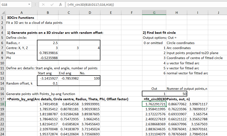
The best fit circles, projected to the XY, XZ and YZ planes, are shown below: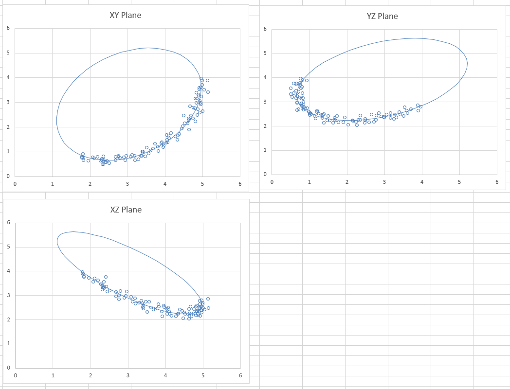
The Matplotlib results from the original code are very similar: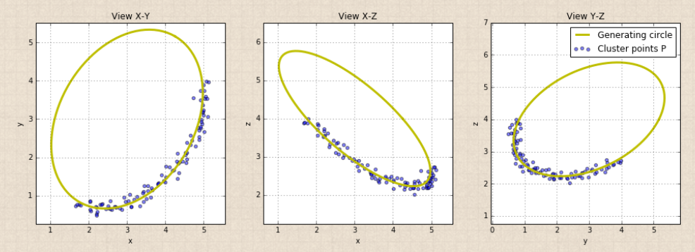
Changing the input data, the graphs automatically re-draw to show the new results: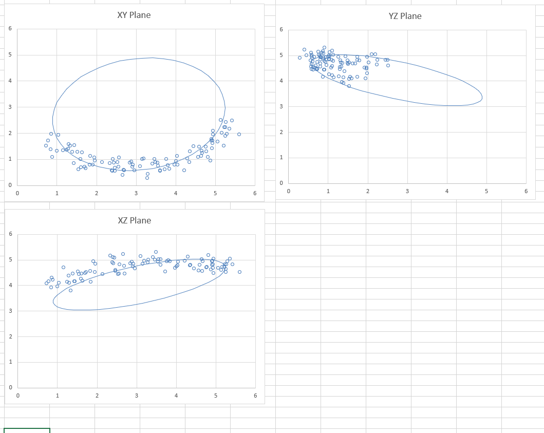
To use different input points (either generated from another source, or real survey data) simply paste the data anywhere in the spreadsheet, and adjust the “3DPoints” range in the Fit_circ3D function, and the chart data ranges for the input data.
To use the spreadsheet:
| … and then py_… on py_xlCBA 0.04 | |
| Alternative iterativ… on Newton-Raphson and Brent… | |
| Alternative iterativ… on Scipy functions with Excel and… | |
| Z on Downloads | |
| py_xlCBA – Sup… on py_xlCBA update | |
| dougaj4 on Downloads | |
| Z on Downloads | |
| py_xlCBA update | Ne… on Calling PyCBA from Excel | |
| Z on Reinforced concrete elastic an… | |
| dougaj4 on Reinforced concrete elastic an… | |
| khoitsma on Continuous beam animations wit… | |
| Z on Reinforced concrete elastic an… | |
| dougaj4 on Reinforced concrete elastic an… | |
| dougaj4 on Reinforced concrete elastic an… | |
| Z on Reinforced concrete elastic an… |
